Henchling Enforcer / Splinterlands Art Contest (ESP/ENG)
Bienvenidos y saludos a todos aquellos que disfrutan el paso a paso en mis post, espero puedan aprender algo nuevo en esta y todas mis entradas.
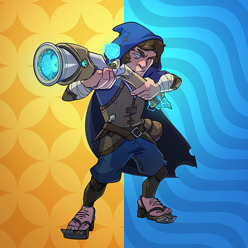
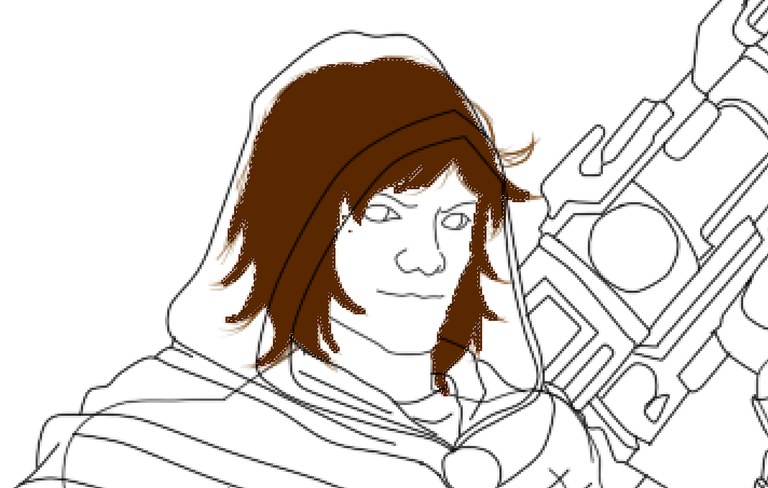
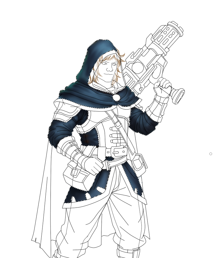
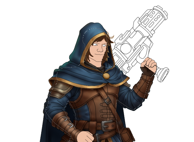
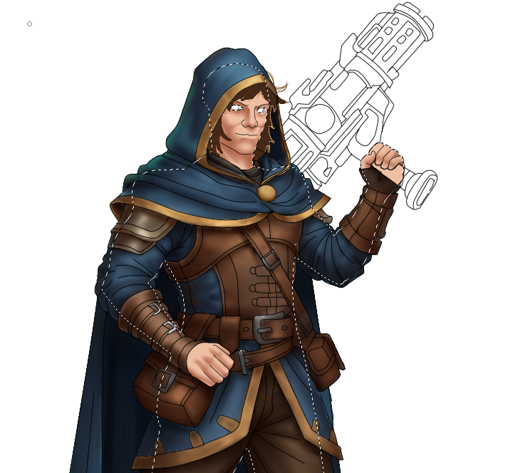
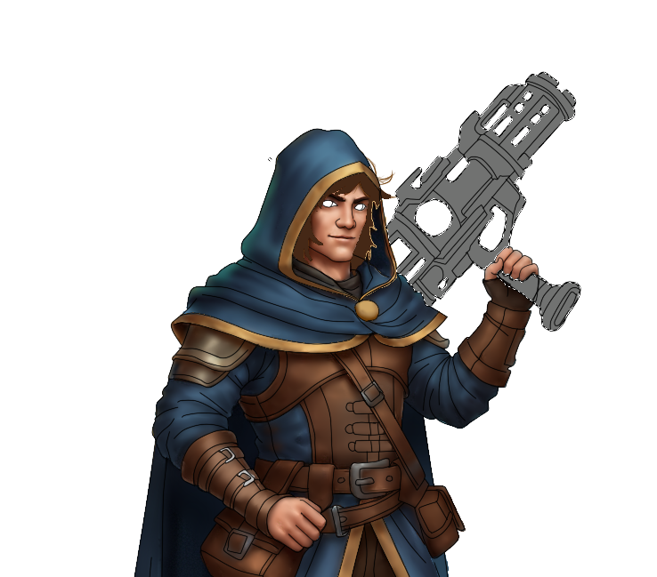
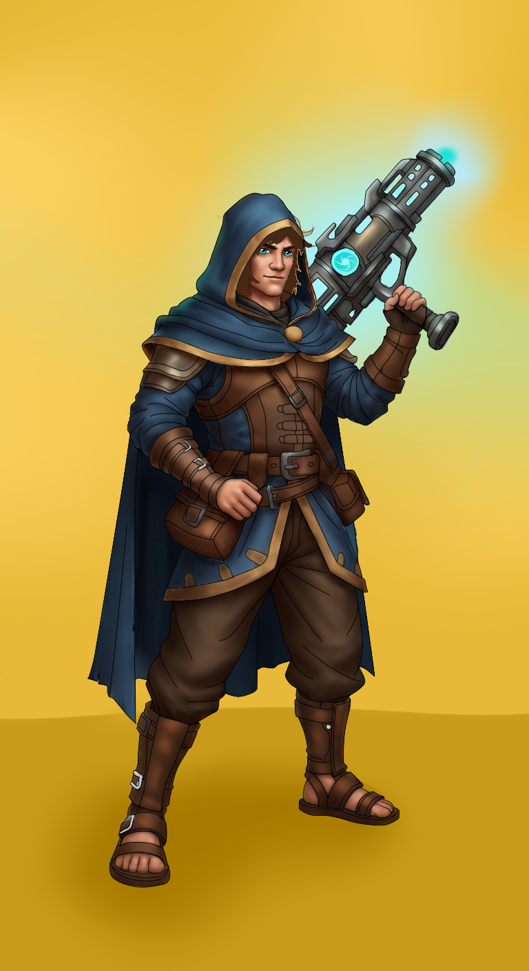
Empezamos este post dedicado a la comunidad de @splinterlands con un nuevo diseño y esta vez es el turno de Henchling Enforcer, para el cual usaremos como referencia su arte oficial.
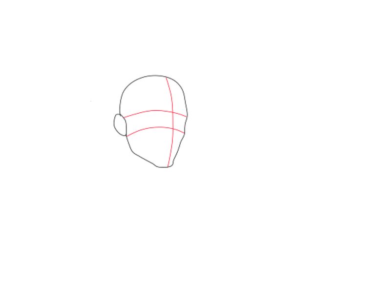
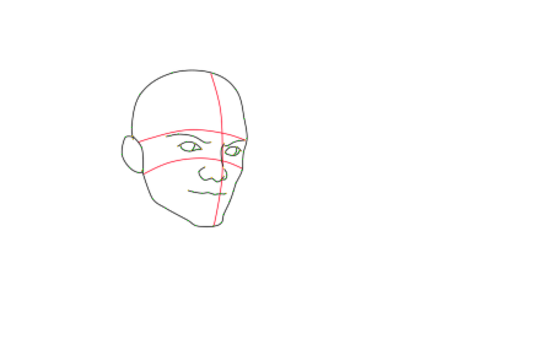
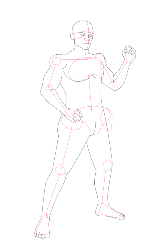
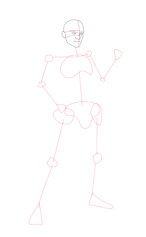
Vamos a empezar con nuestro nuevo proyecto primero hay que plasmar nuestra idea en una hoja blanca con ayuda de un lápiz, color o carboncillo, es indiferente el material que utilicemos, ya que este se trata de hacer una guía de como queremos que quede nuestro diseño.

DIGITALIZACIÓN
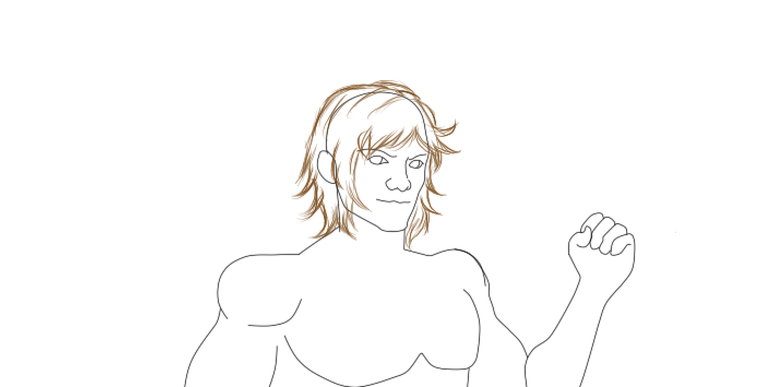
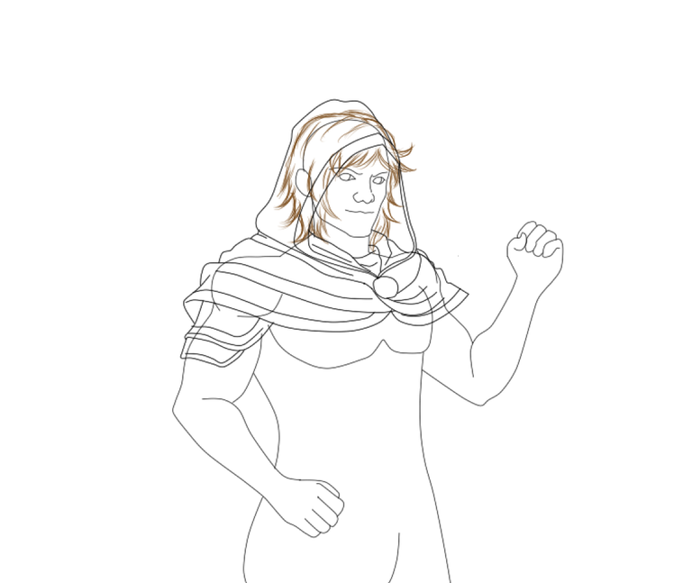
Luego de haber terminado nuestro boceto a mano, digitalizamos pasando nuestro diseño por escáner o tomándole una foto con nuestro móvil, en mi caso para realizar el arte he utilizado el programa “Paint Tools Sai”, ya que estoy muy familiarizado con este. Porque me permite organizar capas de lineado y de pinturas, dándome más libertad al momento de corregir errores en el diseño inicial.
Así que guiándonos de nuestro boceto, aunque siempre habrá cambios dependiendo del concepto o la percepción en la que quiera plasmar la idea, pero todo comienza con una idea inicial.
 |  |  |  |  |
|---|---|---|---|---|
 | 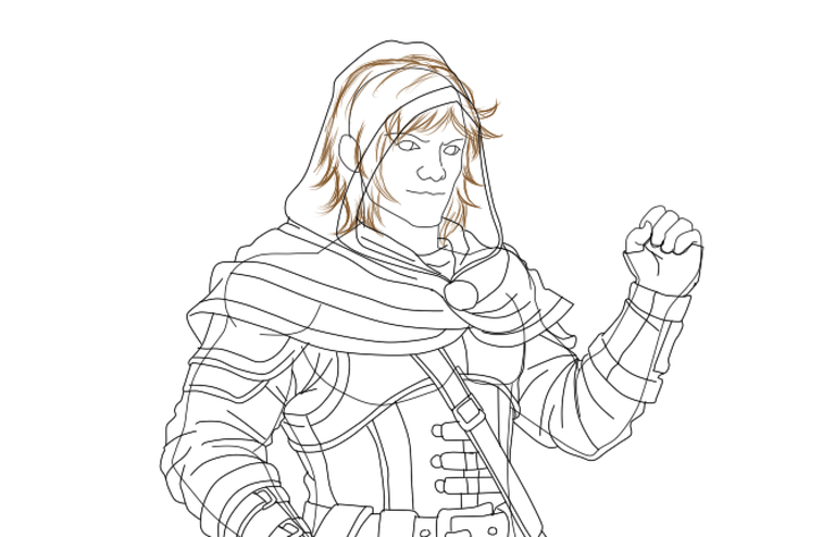 | 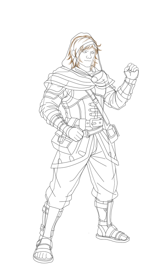 |  |
Cabe destacar en esta sección de digitalización se hace por separado lo que es anatomía (cuerpo) y lo que es la vestimenta del personaje, previamente dibujada a lápiz y montada en el programa de dibujo o digitalizada, esto nos ayudara a calcar nuestro diseño original.
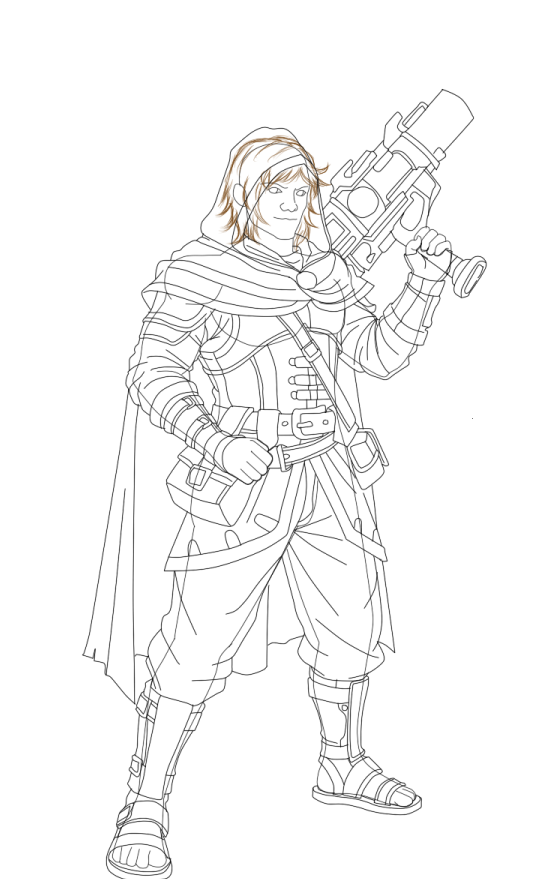
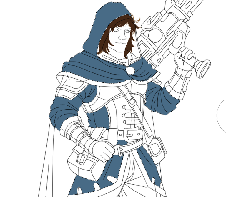
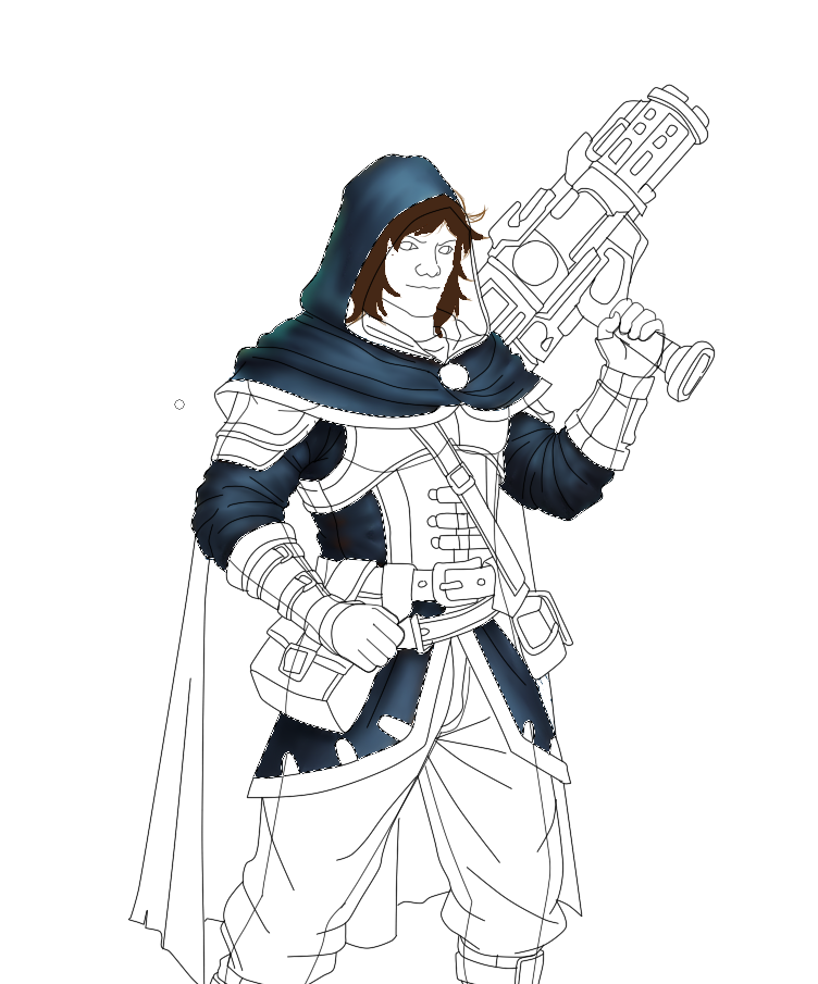
COLOREANDO
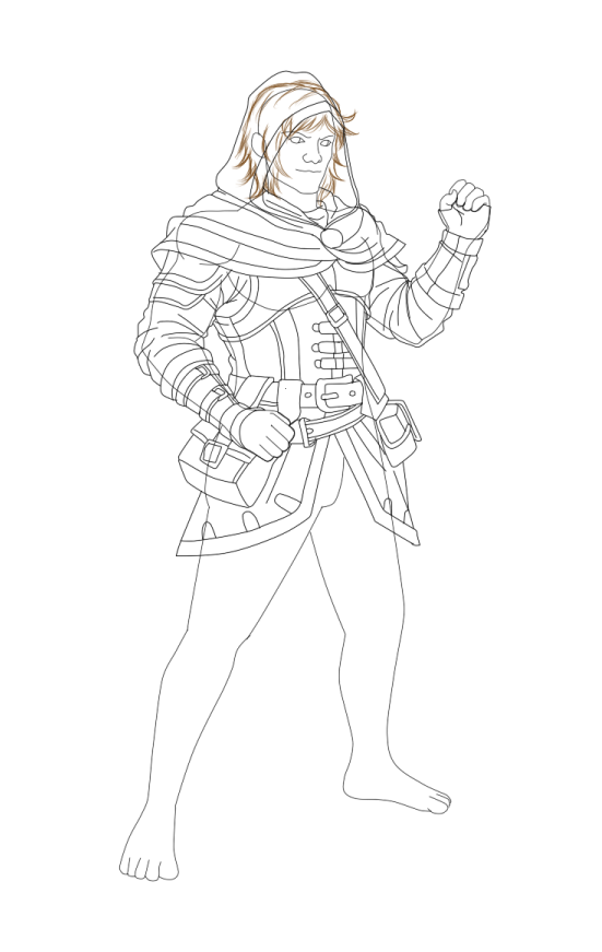
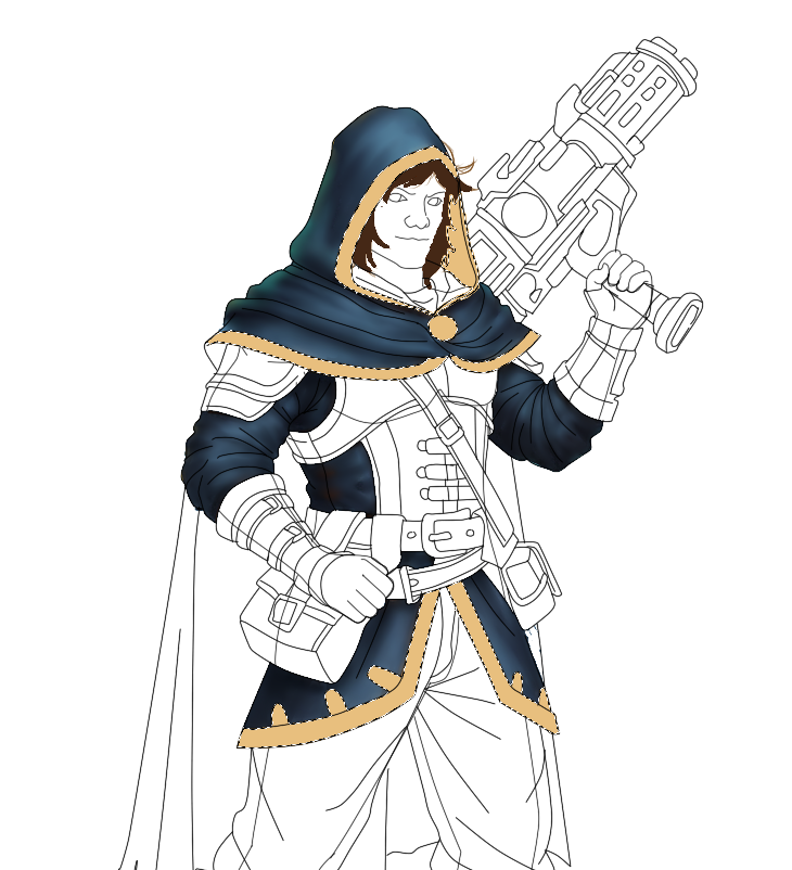
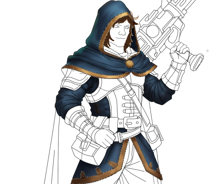
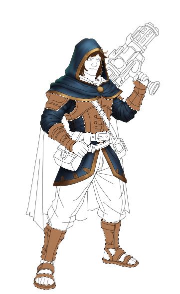
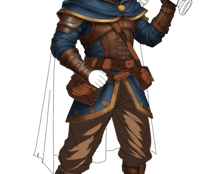
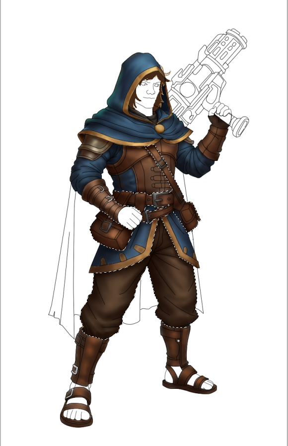
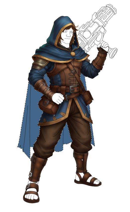
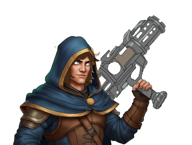
Luego de tener nuestro boceto digitalizado nos dedicamos ahora a colorear lo cual tenemos como referencia el arte original, pero, sin embargo, le colocaré colores y elementos que caracterizan mi arte y darle unos colores y un brillo único para que resalte todo.
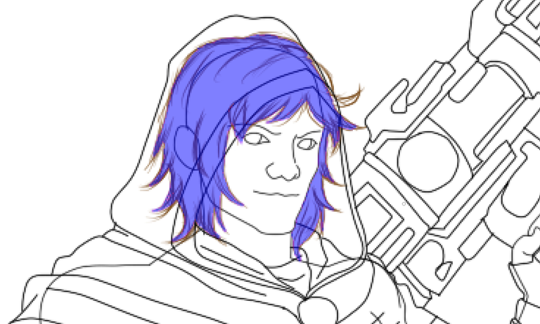
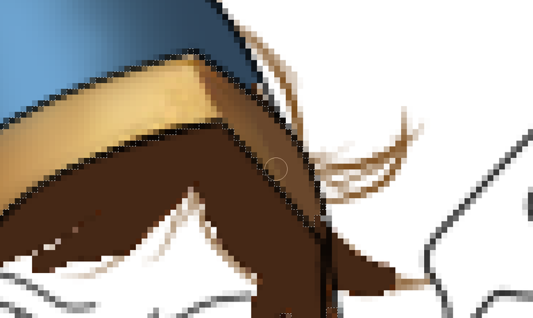
En este proceso utilicé muchas técnicas la principal es marcar con color en una capa separada donde estará el cabello con colores referentes y oscuros, ya que este será el fondo o base para hacer el cabello encima de estos tonos, pero difuminándolos y mezclando, puesto que quiero hacer algo que demuestre la fiereza de este personaje.
En esta ocasión les mostraré paso a paso como es el proceso
Paso 1.
Comenzamos creando la forma del cabello guiándonos del modelo original, eligiendo un color claro, vamos a marcar bordes para saber donde están ubicados.
 |  |
|---|
Paso 2.
Una vez realizado el cabello procedemos al color piel y colocamos un color siempre claro yo uso este método para ir agregando colores oscuros luego, y así obtener profundidad mayormente se usan de 4 a 5 colores distintos para realizar estos resultados más adelante vamos a ver un claro ejemplo de esto.
 |  |  |  |  |
|---|---|---|---|---|
 |  |  |  |  |
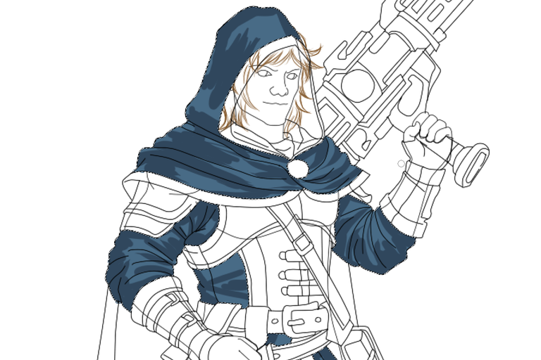
Paso 3.
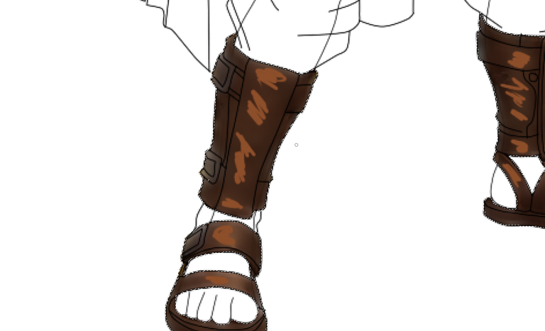
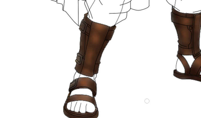
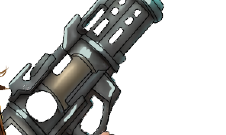
Aquí vemos con más claridad lo que antes mencionaba para lograr una mayor profundidad en texturas o resultados más realistas en nuestros diseños, siempre debemos explorar variedades de colores y mezclar para conseguir un resultado en claro-oscuro en la ropa y piel esto es importante, pues si usamos pocos tonos nuestro diseño queda plano, esto puede tardar horas en obtener un buen resultado, recomiendo buscar o ver paletas de colores haciendo una pequeña búsqueda en Google de paleta para tonos de piel y se les facilitará mucho más.
 |  |  |  |  |
|---|---|---|---|---|
 |  |  |  |  |
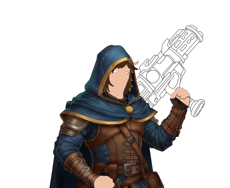
Paso 4.
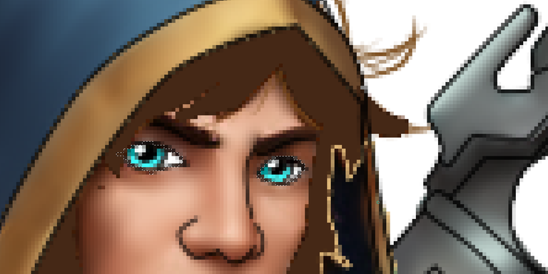
La expresión o rostro es en teoría lo más importante en todo el diseño, ya que si todo nos queda de 10, si en expresión no logramos algo bueno, por lo menos para mí el diseño queda totalmente mal.
Los labios son en teoria facil, pero fundamentales.
.................................................................
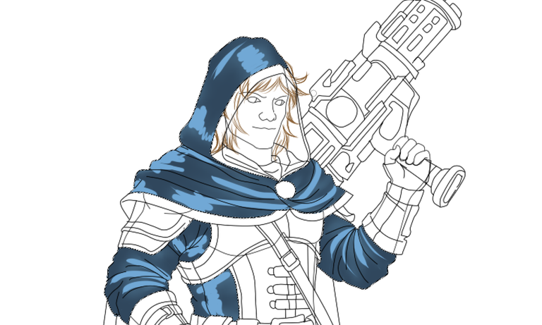
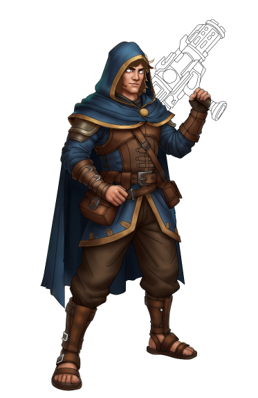
F U L L // A R T
.................................................................
SI QUIERES EVITAR OLVIDAR TUS RECUERDOS, GUARDALOS SIEMPRE EN TU CORAZON.
Considera unirte a nuestro trail de curación en HIVEVOTE haciendo clic en la imagen inferior, Les agradecemos todo el apoyo.

A todos los artistas ahí afuera en HIVE, si alguna vez se sienten solos y perdidos, únanse al canal de Discord de Bokura No Digital World
! [ENGLISH VERSION GENERATED BY GOOGLE TRANSLATE]
Welcome and greetings to all those who enjoy the step-by-step instructions in my posts. I hope you can learn something new in this and all of my entries.
We're starting this post dedicated to the @splinterlands community with a new design, and this time it's the turn of Henchling Enforcer, for which we'll be using their official art as a reference.
Let's start with our new project. First, we need to capture our idea on a white sheet of paper with the help of a pencil, colored pencil, or charcoal. It doesn't matter what material we use, since this is about making a guide for how we want our design to turn out.
DIGITALIZATION
After finishing our hand-drawn sketch, we digitize it by scanning it or taking a photo with our phone. In my case, I used Paint Tools Sai to create the artwork, as I'm very familiar with it. It allows me to organize layers of linework and paint, giving me more freedom when correcting errors in the initial design.
So, let's take our sketch as a guide. Although there will always be changes depending on the concept or perception I want to capture, everything starts with an initial idea.
| | | | |
|---|---|---|---|---|
| | | |
It is worth noting that in this digitization section, the character's anatomy (body) and clothing are drawn separately, previously drawn in pencil and assembled in the drawing program or digitized. This will help us trace our original design.
COLORING
After having our digitized sketch, we now turn to coloring. We use the original art as a reference. However, I'll add colors and elements that characterize my art and give it a unique shine and color to make everything stand out.
In this process, I used many techniques. The main one is to colorize a separate layer where the hair will be, using key and dark colors, as this will be the background or base for creating the hair on top of these tones, but blending and blending them, since I want to create something that demonstrates this character's fierceness.
This time I'll show you the process step by step.
Step 1.
We begin by creating the shape of the hair, guided by the original model, choosing a light color, and marking the edges to determine where they are located.
| |
|---|
Step 2.
Once the hair is done, we proceed to the skin tone and always use a light color. I use this method to gradually add dark colors later, and to achieve depth. I usually use 4 to 5 different colors to achieve these results. Later, we'll see a clear example of this.
| | | | |
|---|---|---|---|---|
| | | | |
Step 3.
Here we see more clearly what I mentioned before to achieve greater depth in textures or more realistic results in our designs. We should always explore color varieties and mix to achieve a light-dark result on clothing and skin. This is important, because if we use too few tones, our design will end up flat. This can take hours to achieve a good result. I recommend searching for or viewing color palettes by doing a quick Google search for a palette for skin tones, and it will be much easier for you.
| | | | |
|---|---|---|---|---|
| | | | |
Step 4.
The expression or face is, in theory, the most important aspect of the entire design. If everything is perfect, if we don't achieve anything good in terms of expression, at least in my opinion, the design is completely flawed.
The lips are, in theory, easy, but essential.
.................................................................
F U L L // A R T
.................................................................
IF YOU WANT TO AVOID FORGETTING YOUR MEMORIES, ALWAYS KEEP THEM IN YOUR HEART.
Grateful to all of you who are also part of my life. 💖
Well, from here I say goodbye, I hope you like my work like I do every day that I see and know that there are people dedicated to commenting on me and giving me encouragement to continue.
Congratulations @ushiro.snow! You have completed the following achievement on the Hive blockchain And have been rewarded with New badge(s)
Your next target is to reach 50000 upvotes.
You can view your badges on your board and compare yourself to others in the Ranking
If you no longer want to receive notifications, reply to this comment with the word
STOPCheck out our last posts:
Join us on the Ecency Discord
This is cool. @tipu curate 7
Upvoted 👌 (Mana: 0/70) Liquid rewards.