LeoFinance new UI experience
It's finally here! The new @leofinance UI has been fully released. It feels like the long-awaited Eth merge. Firstly, I have to say that @khaleelkazi and the team have delivered, and the WEN question is now answered. Of course, there is still work to be done because nothing is ever perfect. For a long time, I wanted to write my thoughts when the UI was in the alpha stage, but I always thought maybe later. However, I believe now is the time. Everything I am going to write are just my thoughts, and I hope they will be helpful because I believe that @leofinance has been on fire these past few months. If they keep it up, they will make a lot of noise.
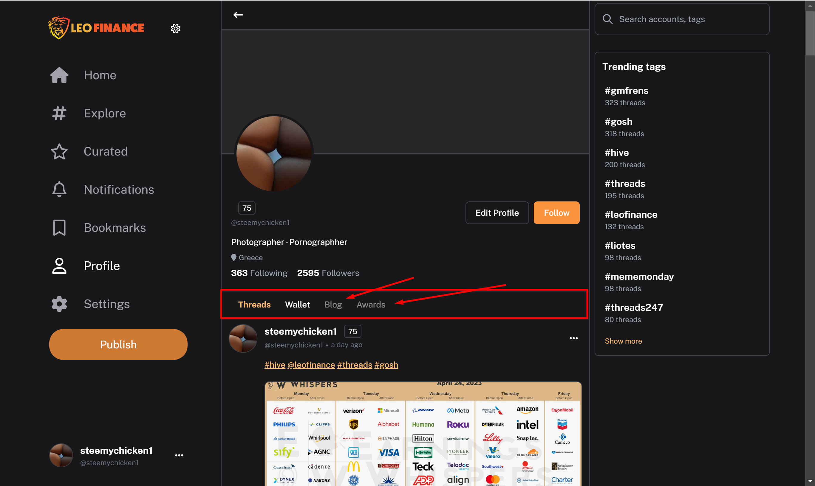
The Curated tab is not working correctly and is not showing the curated posts by @leo.voter. It's not a big deal
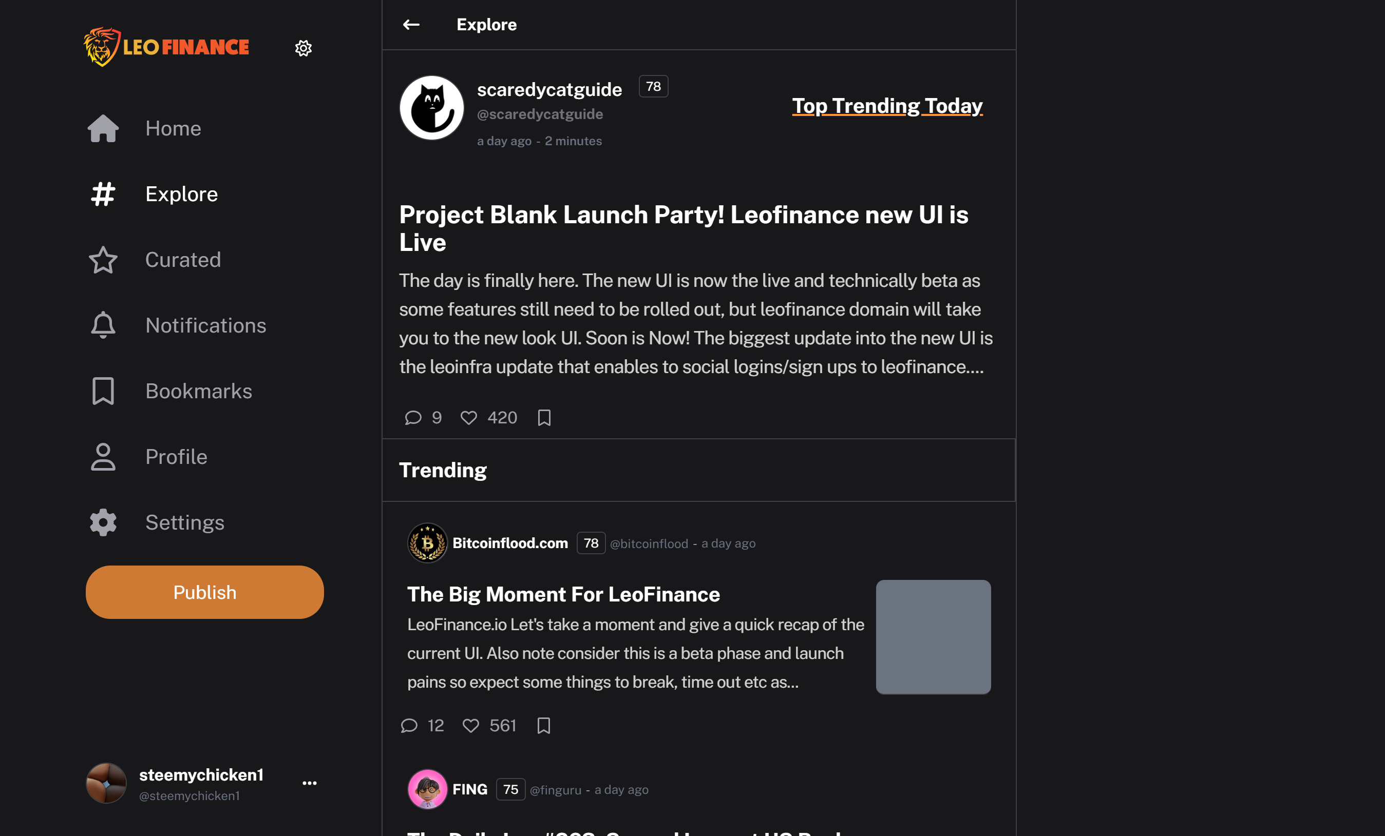
I would prefer it if the Explore tab had separate sections or tabs to view Trending, New, Hot, etc. Currently, I have to scroll down to view these options, and if I choose the 'Show More' option, the next section will go further down, making it difficult to navigate..
Just like the home tab which is excellent
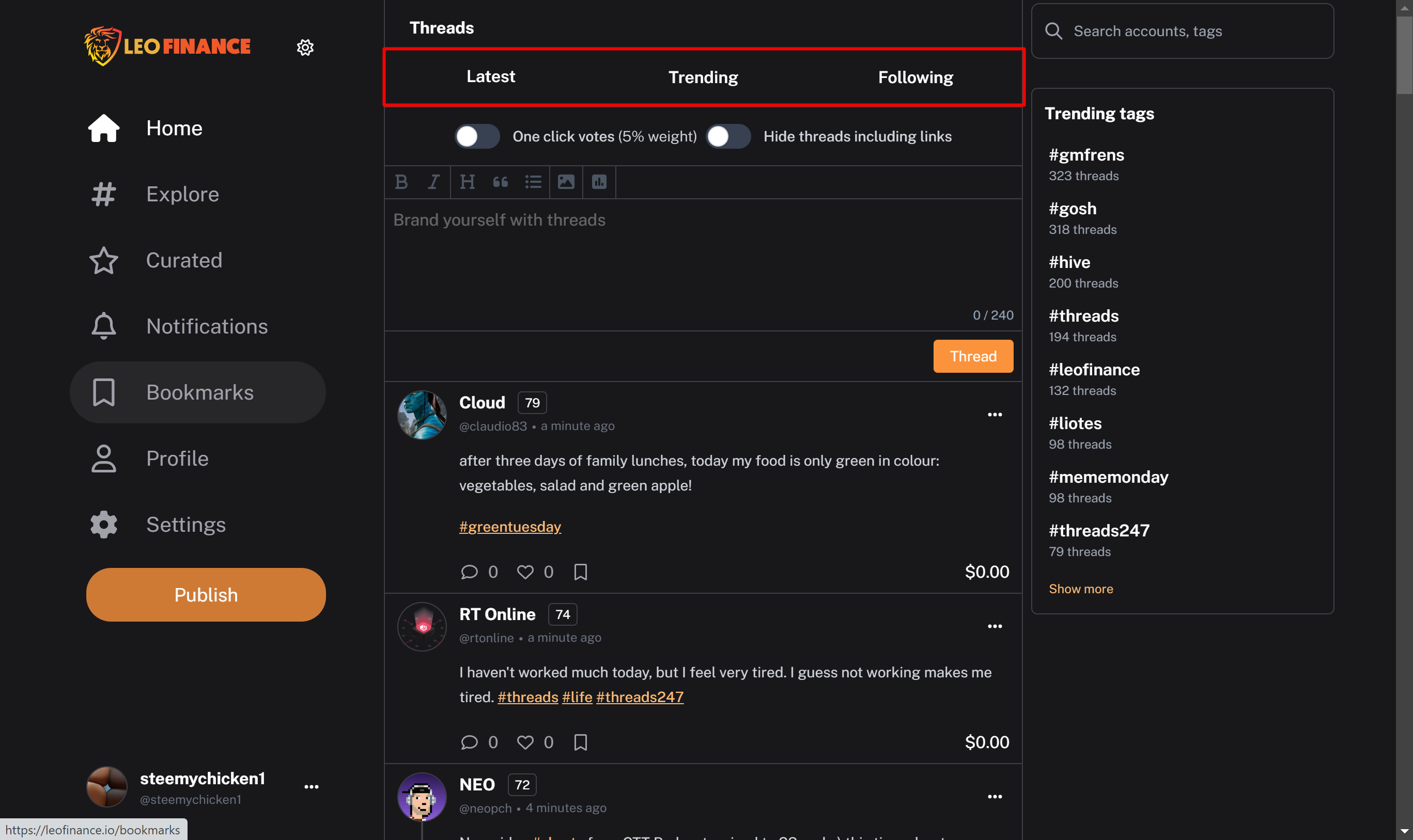
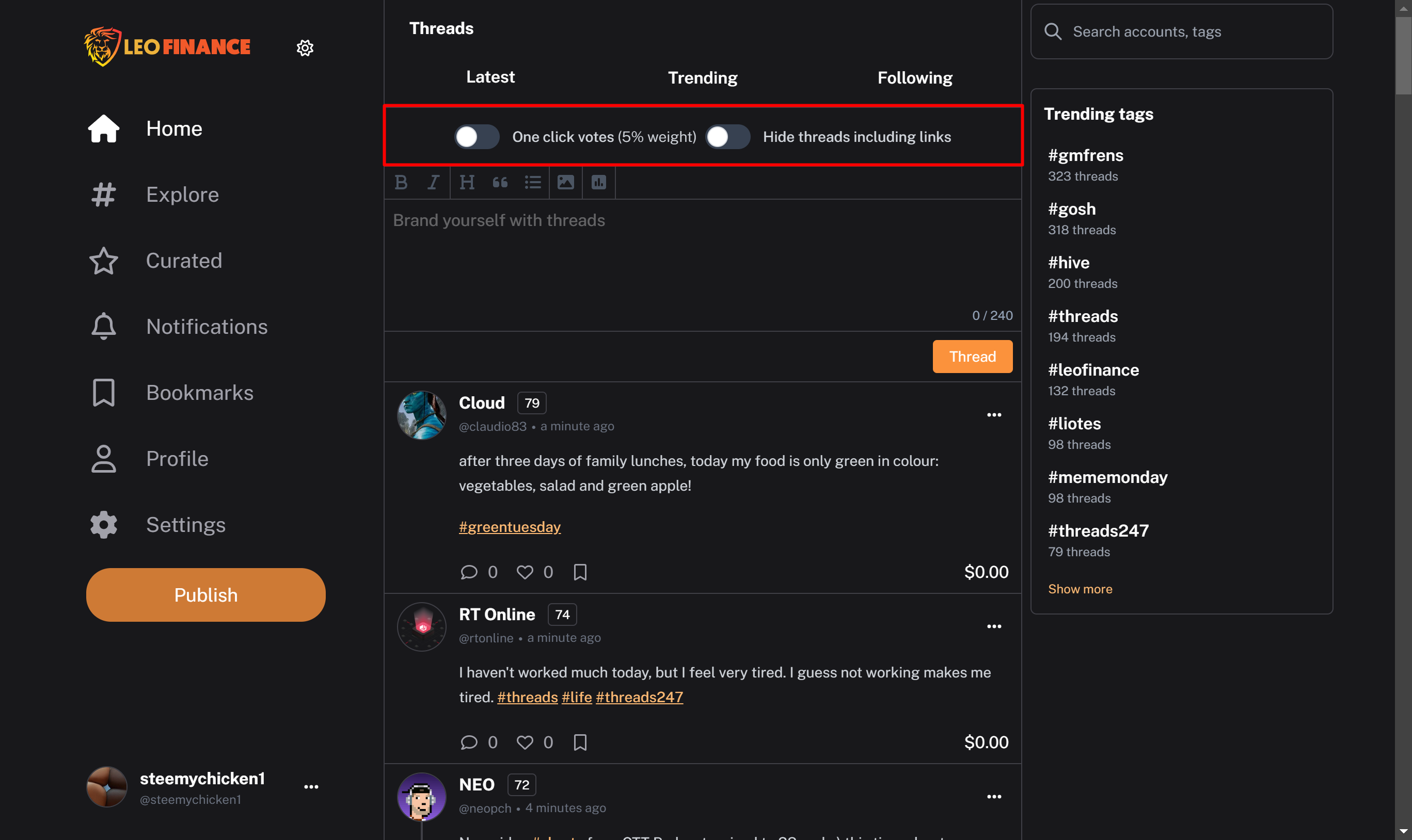
I really like the one click vote option and the option to hide any thread with a like to keep spamming to a minimum
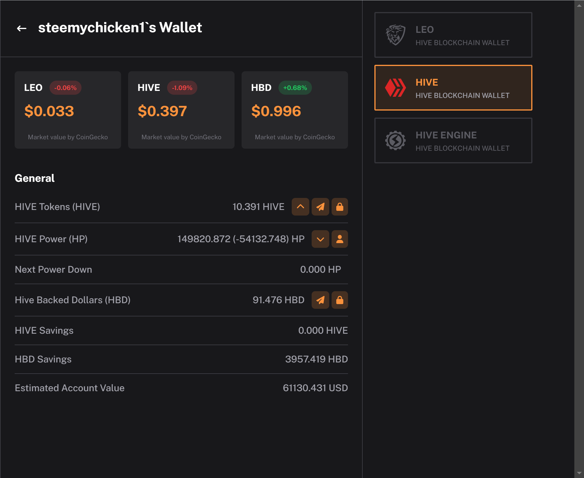
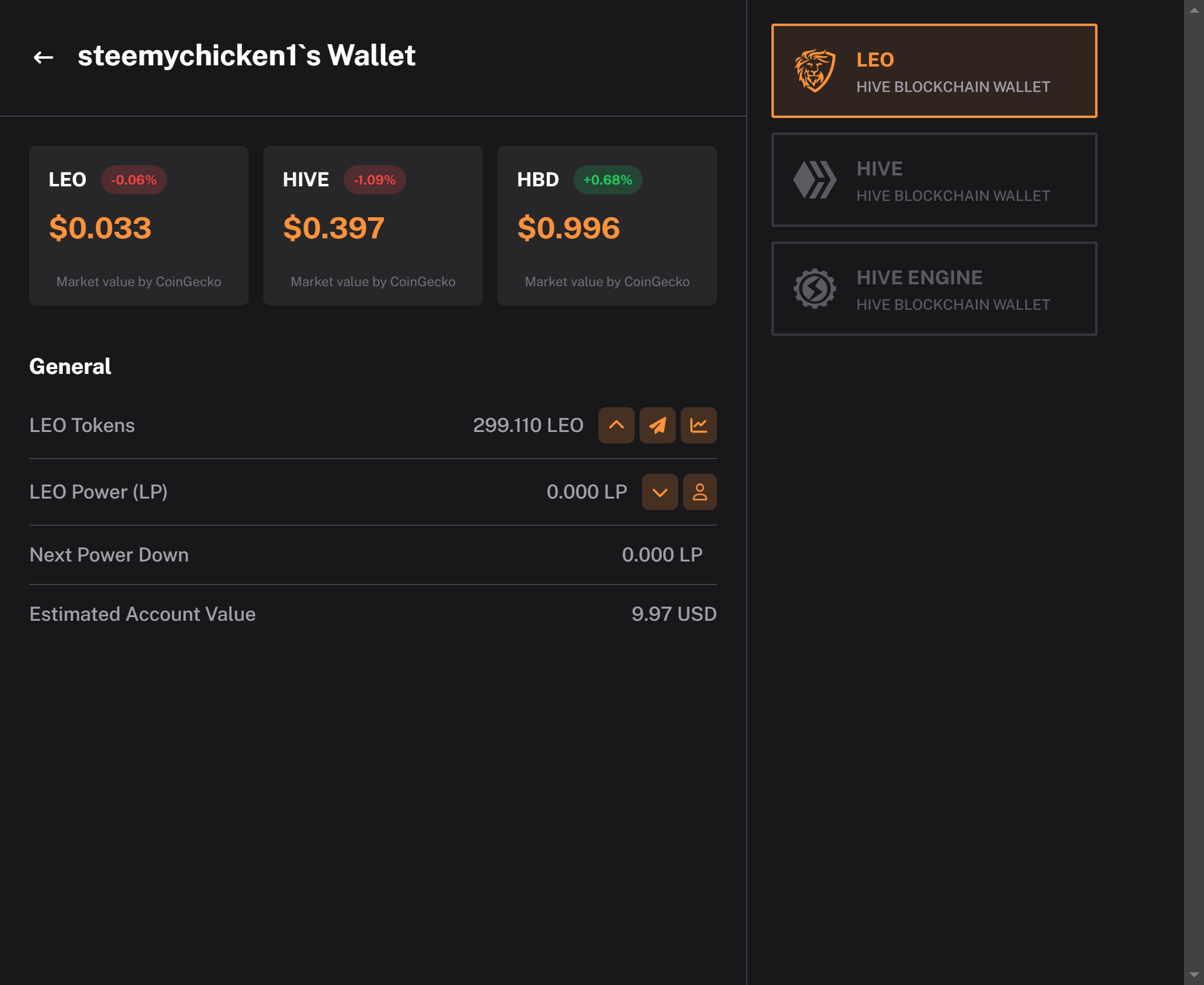
The wallet experience is just fine maybe adding some charts under the prices and not having to click the transfer to leodex choice.
The blog and award tab seems unclickable
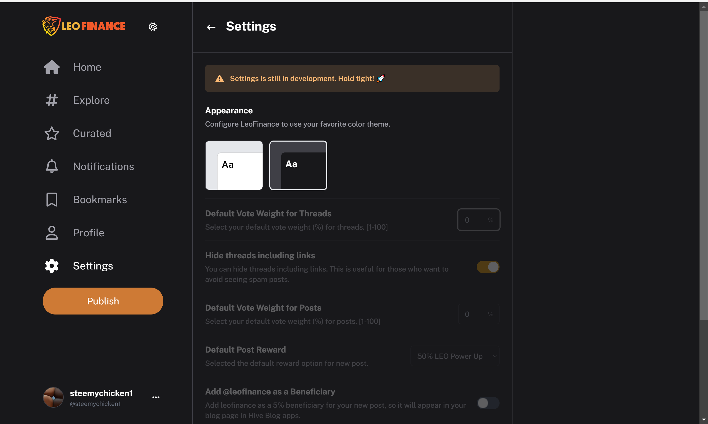
More settings are coming soon??
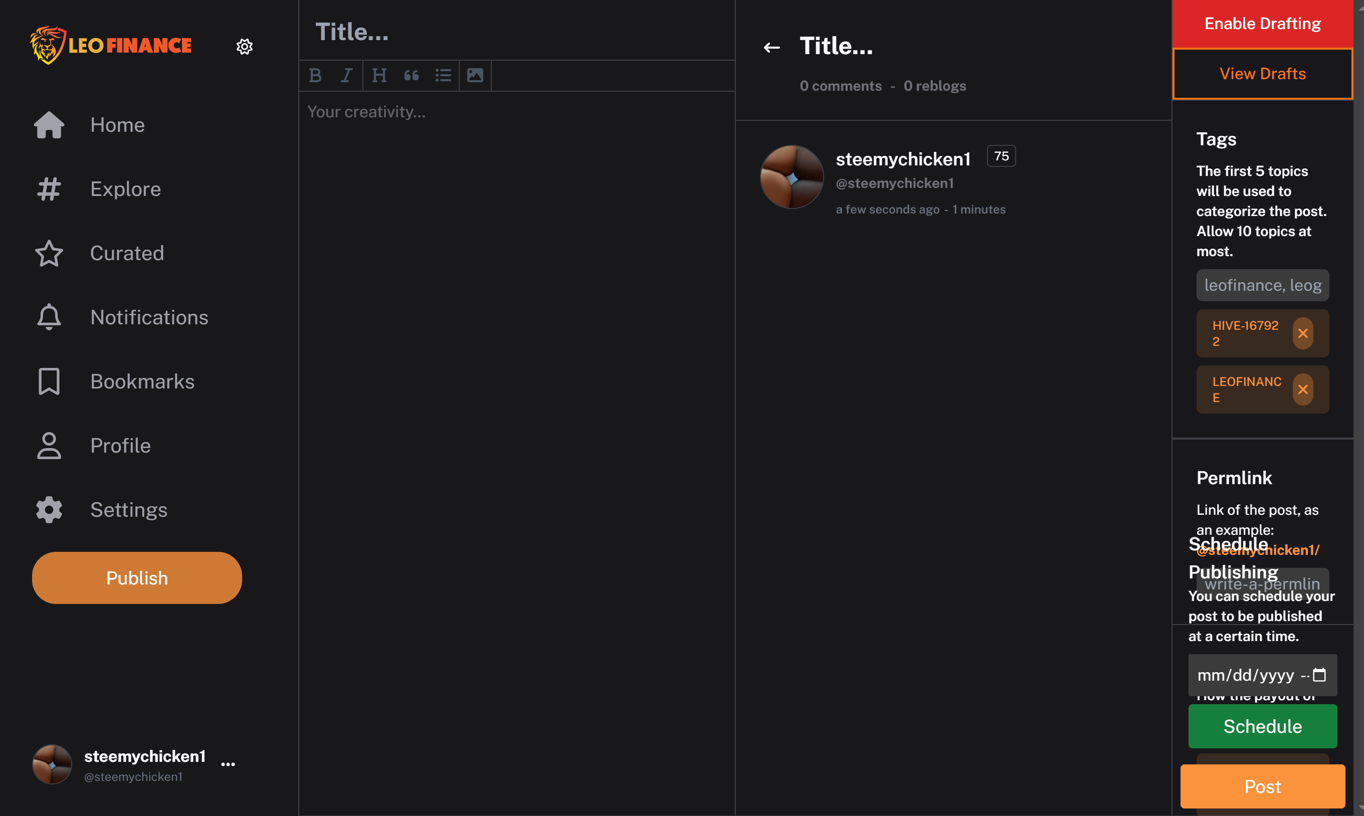
Lastly, I want to mention what I really don't like about the UI. When I try to write a long post, everything in the corner right section seems cramped and some elements are not even visible. I believe this needs to be fixed immediately, possibly by putting it in a pop-up window before posting.
Overall, I think great work is being done, and the future looks good. Congratulations to the team, and keep up the good work.
P.S
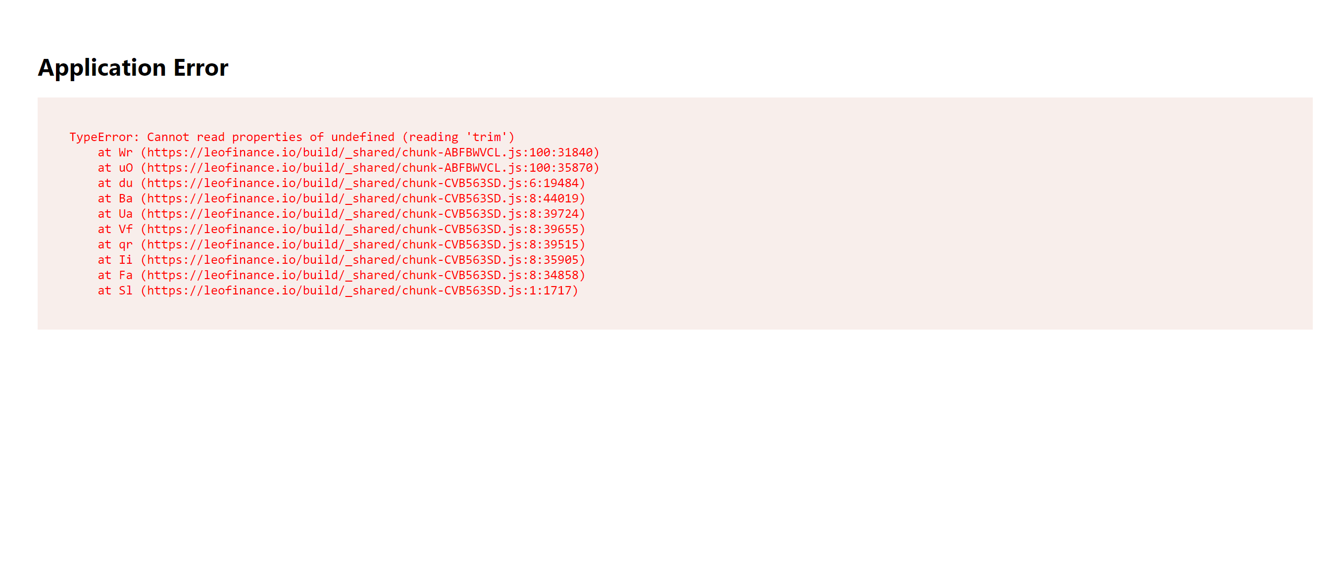
This happened when i tried to publish.
Posted Using LeoFinance Alpha
A lot of the experiences are just fine, except the posting experience on mobile, but truly, they've delivered like you said. I think these issues could be fixed with time. The user's experience would matter a lot
yes exactly there are just minor problems that they will probably get fixed easily . I really like the experience and i am still trying to learn how to navigate
Posted Using LeoFinance Alpha
Wow, this is the first comment I've seen made on the UI. it's definitely going to stick with them and we'd come to love the experience.
I tried posting my previous post on the new UI but experience some hiccups on the process to publishing the post. I think the long form content needs a bit of polishing but overall, everything is working fine. Great work from the team.
Short content creation will be added to Ecency.com as well. Would be good to hear your feedback once it is out. Target is this month with dedicated special view for it... You can interact with threads as well.
Really cool can wait to see it especially how it will look in the iOS app!
It will be website only until app catches up. For hint: remember tweetdeck?!
Interesting. Can’t wait now 😂
They are really working hard to fix everything. You really observed the bugs, i appreciate their efforts so much. We will get it right soon
Yes I have faith in them !
I don't know much about it it, but from what I understand they have come a long way and working hard at it. I am willing to give them a shot and wait for them to get things ironed out. However, for most stuff I am fairly adjusted to PeakD and Ecency at the moment.
Well I do believe that if they develop an android and iOS app they might even become the number one portal.
I'm having the same issues with the posting window. On top of that I can access the my blog section. Other than that the UI looks pretty neat. Maybe a future update will fix these.