Splinterlands Art Contest Week 368: Queen of Crows

This here is my entry for the weekly Splinterlands Art contest which can be found RIGHT OVER HERE, CLICK HERE, THIS LINK WILL TAKE YOU TO THE PLACE
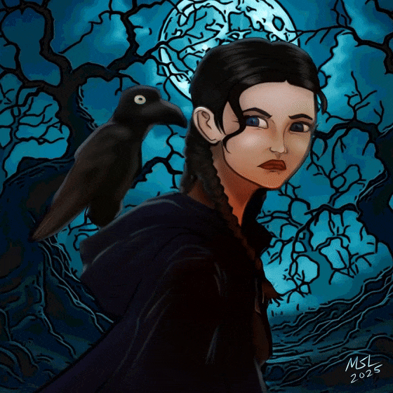
Drew this the other day when I should have been working on my web comics. Here's the Queen of Crows. She looks a bit young for a "queen" more like a Princess of Crows. And a bit Wednesday Addams.
Here is the timelapse video. As a value add, I animated the final drawing and tacked it onto the end of the video just for fun. Surely that will make everyone watch the video all the way through to the end.
Created using Clip Studio Paint Pro on a Surface Pro 7+.
https://rumble.com/v70qdu2-queen-of-crows.html?mref=18dagn&mc=d3obe

Compare with the original card art:

- Sketch out a rough draft. I start with a 40px Pastel Brush for my rough draft. I refine it a little bit with a 20px Mechanical Pencil. Then convert it to blue tone for nostalgia sake.

- Line art. I use a fat G-pen for the bulk of the outline. 15px to 20-px wide. Then a finer brush for the interior details. That looks like this.

- Flat silhouette layer. Hide the rough layer, then I use the Magic Wand select tool to select everything that is not my figure. Then I invert the selection area and fill the entire figure with one color. Whoops. I also see now that I must have accidentally merged my flat color layer onto the silhouette layer. Looks like I'm skipping a step.

- Adjust line art. I make a copy of the line art layer and reduce the opacity to 50%. Then on the copy I blur it using the Gaussian blue effect, then erase anything that is outside of the silhouette layer. This just softens the line art a bit.

- Rough shadow layer. Tried something different. I used the autocolor feature to make a new multiply layer. Reduced the saturation and light way down and voila, instant shadow layer. Then I go back and erase sections with the airbrush tool; so I am erasing the highlights rather than adding more shadows. Quicker that way when the scene is dark. Of course the auto feature is messy, I had to go back and render the face, but that dark cloak... no one cares about it.

- Added a second multiply layer just because I wanted to add some weird ambient lighting. She looks like she's in a graveyard and for me necromancy is usually associated with green. Anyone else think that?

- Made a new Overlay layer on top of everything else to add in some highlights.

- Then I use an AI generator for the background. I think I asked for Haunted Forest. I run the image through an art filter to make it look like rough, fat line art and simplify the colors. Then I reduced the saturation and lightened it so that the figure stays visible.
- Animate! I've just been playing around with Grok Imagine uploading some of my old drawings and making short videos. So I took the final version of this drawing and created this:
Pretty cool, right? Grok Imagine automatically generates audio with music as well. You can't hear it on this page because I converted the video into a GIF so I could upload it on HIVE. But, if you want the full effect watch the timelapse video and stay to the end for the last 6 seconds.
Okay, that is what I've got for this week. Hope you enjoy the drawing, the videos, the commentary. Live long and prosper. Unless you are wearing a red shirt. In which case, you just dead.
Thanks for sharing! - @cieliss
