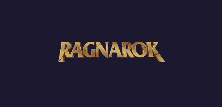
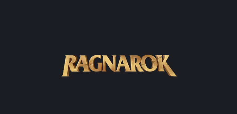
My take on Ragnarok Game Logo Design Contest
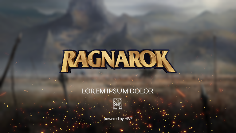
Hello, Thank you @ragnarok.game for this lovely logo contest. I am glad to be able to participate. This is my entry for the contest. I am colorblind so forgive me on that one ^^ probably we are seeing two different things in the screen. I dont know what you see , I hope you like it.
You can check the Logo Contest Post by clicking here
Design Process
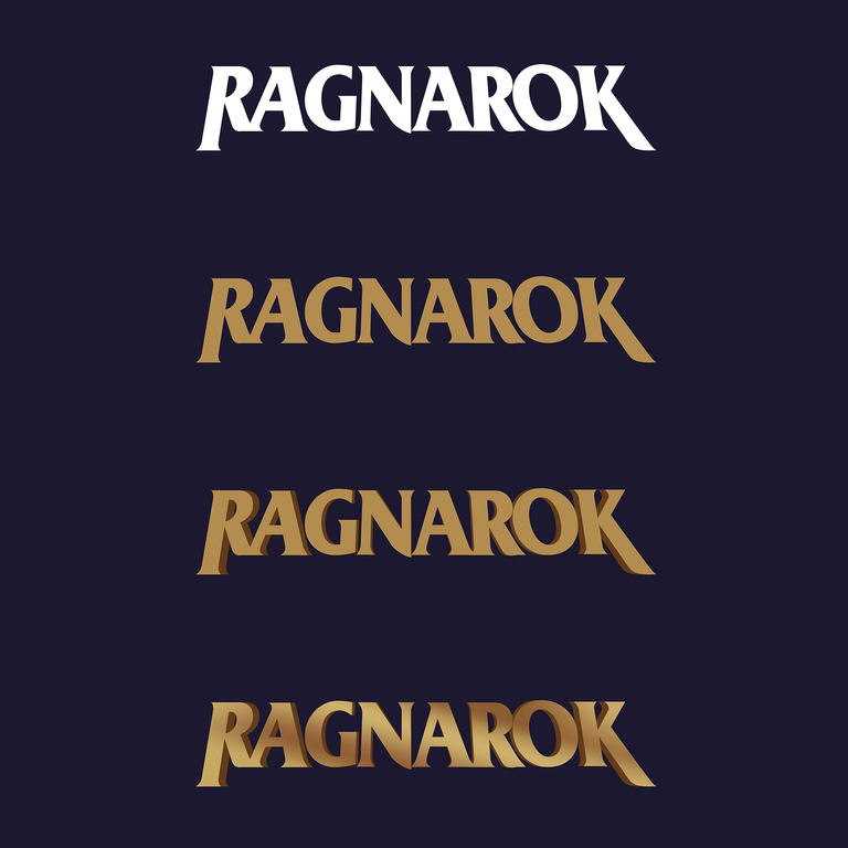
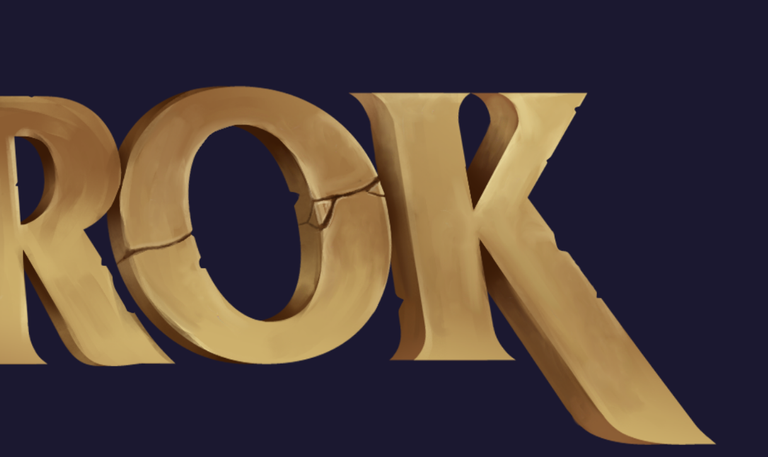
This logo is almost entirely hand painted. This first 4 step is a ground for the following painting steps. After searching and choosing a suitable font, I create desired effect by modifying the letters. After that for the three dimensional text effect I copy the front layer and resize it to match the desired thickness.
Painting Process
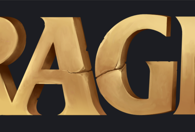
This step took me 2 days from start to finish. I have custom made brush pack for concept art paintings. I used textured brush for this work.
Software : Adobe Photoshop CC
Hardware : Xp Pen Deco 03 Wireless Graphic Tablet
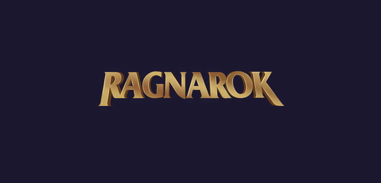
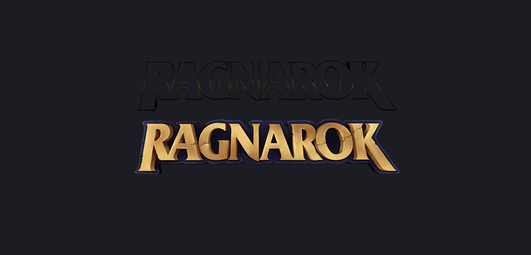
Rendering
Details.. details....


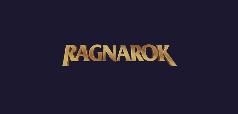
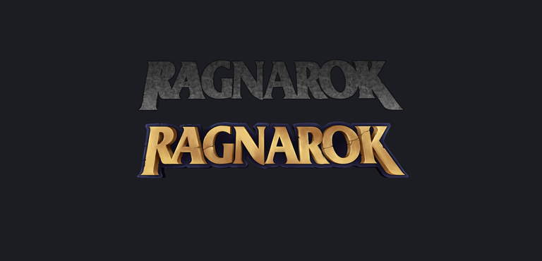
Background Text Effects

"Simple is beautiful" is my motto when its comes to designing things. I've been a designer for 13 years. I designed furniture, instruments, graphics, logos, I painted people. Years of experience have taught me that simple results are harder to achieve. When you want to have beautiful things, humans tend to overcomplicate and overthink. Thus will have a chaotic results. Simple is really the most beautiful outcome.
I researched the game industry and find out every serious game has simplistic yet elegant logos. This is why I approached this contest by making a logo looks like belong to a serious AAA game.
Electronic-terrorism, voice to skull and neuro monitoring on Hive and Steem. You can ignore this, but your going to wish you didnt soon. This is happening whether you believe it or not. https://ecency.com/fyrstikken/@fairandbalanced/i-am-the-only-motherfucker-on-the-internet-pointing-to-a-direct-source-for-voice-to-skull-electronic-terrorism
Great work! :)
Thank you @fnvdesigns
No problem @ruen
It's simple, but clean and the visual effect is awesome! :)
So keep it up!
Detay şov

Detaylara özellikle bayıldım ve renk de bence mükemmel olmuş. Emeğine sağlık, çok karışık değil ama yine de göze hitap eden bir logo olmuş.
Çok teşekkür ederim. Sade bir güzellik yakalamaya çalıştım.
Sade ve şık olmuş, beğendim.
Teşekkürler, Sadelik genelde basitlikle karıştırılıyor. Sade güzelliği yakalamak bence daha önemli.
Her zamanki gibi çok başarılı bir iş olmuş, sadeliğin içindeki detaylar süper 🤞 Yarışmada başarılar dilerim
Teşekkür ederim, keşke son günlere bırakmasaydım biraz aceleye geldi ^^
lovely work on the cracks!
great job : )
Thank you I am a little rusty though, I was in a military for the past 6 months. I missed photoshop, this is the first painting since then.
woah. how was it being in the military for you?
Maybe it has given you an edge in your design.....?
It was hard. I am a more patient person after military. In terms of art this helps a lot. I appreciate what I have in my personal life more.
harika detaylar var
Çok güzel olmuş tebrik ederim 👏🏼
Teşekkür ederim @motivationrainn beğenmene sevindim ^^
Best one I've seen
thank you @nuthman ^^