SplinterScope: Breaking Down My Season – What the Data Says About My Battles
Over the past season, I’ve been collecting and analyzing my own Splinterlands battles using my custom-built analytics tool, SplinterScope. This tool automatically fetches data from the official Splinterlands Battle API and stores it in a local database. From there, it helps me track everything—from overall winrate and SPS earnings to card usage and performance by summoner or element.
This post is a full breakdown of my season. I’ll walk you through my battle results, share insights on what worked (and what didn’t), and highlight what I’m planning to change next season.
Overall Performance
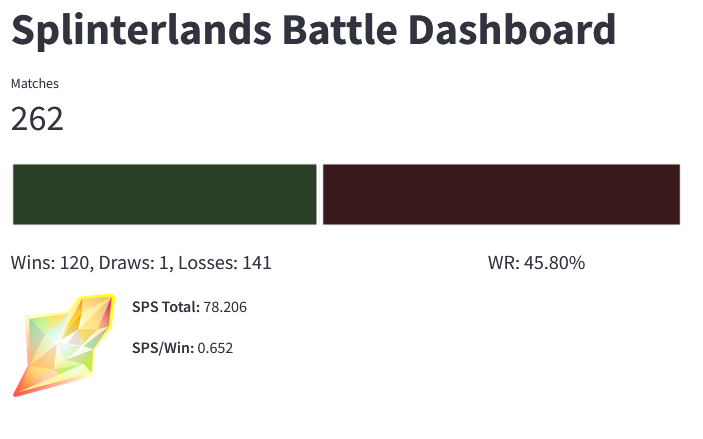
Let’s start with the big picture: This season, I played 262 matches and earned a total of 78.206 SPS. My overall winrate was 45.8%, which leaves plenty of room for improvement. One of my main goals for next season is to increase both volume and efficiency: I didn’t fully use all of my available Energy this time, so I plan to play more matches and try to push my winrate closer to the 50% mark.
Element Breakdown
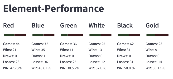
Next up, I analyzed my performance by element. The dashboard visualizes win, draw, and loss distribution for each splinter along with the winrate. The elements are named according to their respective color, as is the case in the raw data I receive from the API. I plan to change this in the future.
Please note that two-element summoners are always counted as the element displayed on the left-hand side of the card.
It quickly became apparent that I have distinct weaknesses with certain elements. For instance:
Death (Black) and Life (White) showed strong results, with winrates above average.
Earth (Green) and Dragon (Gold), however, significantly underperformed.
These numbers confirm a feeling I already had while playing: I often struggle with team composition and counterplay in those elements. This is definitely something I want to address through better deck optimization and practice.
Summoner Performance
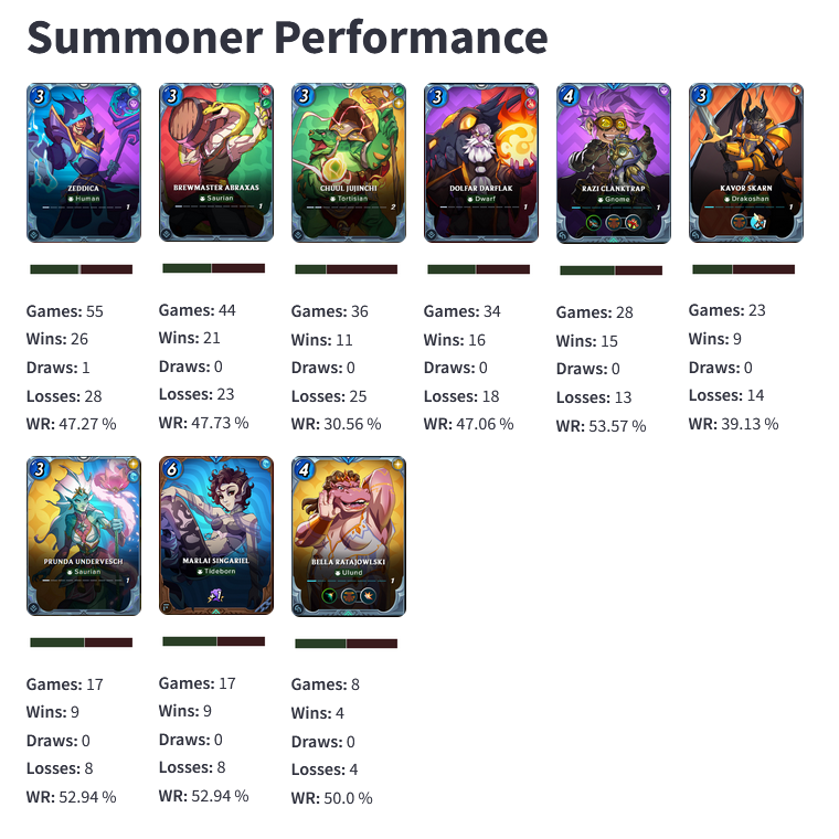
One of the most insightful sections of the dashboard is the Summoner performance area. Here, I track games, wins, draws, losses, and winrate for each summoner I've used, with visual comparisons.
Two examples stood out this season:
Brewmaster Abraxas performed exceptionally well, despite only being level 1. His versatility and synergy with my deck made him a reliable pick.
In contrast, Chuul Jujinchi seriously underperformed. Even at level 2, he never quite clicked with my strategy, especially in Life and Earth splinters. Which is interesting considering the fact that light and earth work much better when seen individually or in combination with other elements
Based on these findings, I’ll stop renting Chuul until I’ve significantly improved the synergy of those two decks.
Most Played Cards
The final section of the dashboard highlights individual card performance. The interactive table lists the top 30 most used cards, sortable by Usage, Wins, or Winrate.
To prevent misleading data, cards with fewer than 3% usage are excluded when sorting by winrate, so one-off games don’t skew the results. This view helps me identify cards that over- or underperform relative to how often I play them. I can't put a screenshoot here, because the table wont fit on my screen and I would have to scroll, but I want to share some insights I found:
- Overperforming Cards: Warborn Chieftain, Quilliun Legionary, Blackmoor Wild Elf (all earth) - 57% WR each and in top 30 of most played cards
- Underperforming Cards: Ulundin Overseer (Neutral), Silverleaf Warlock (Death), Conclave Tracker (Neutral) - with a less than 25% WR each and in top 30 of most played cards.
- Most played cards: Halfling Refugee (Neutral) 100 Games, Bren Palesworn (Neutral) 64 Games, Emberguard (Fire) 54 Games
- Highest Winrate Card (with at least 8 (3%) games): Daigendark Surveyor (Water) 71,43% Winrate
Final Thoughts & Feedback
Analyzing my gameplay with this tool has already helped me spot weak spots and plan my rentals more effectively for the next season. It’s also been incredibly satisfying to turn my data into visual, actionable insights.
That said, the dashboard is still evolving. I’d love your feedback:
- What do you think of my analysis?
- Do you agree with the conclusions I drew?
- What features would you like to see added to the tool?
Feel free to reach out with comments, suggestions, or ideas. Thanks for reading, and good luck in your battles!