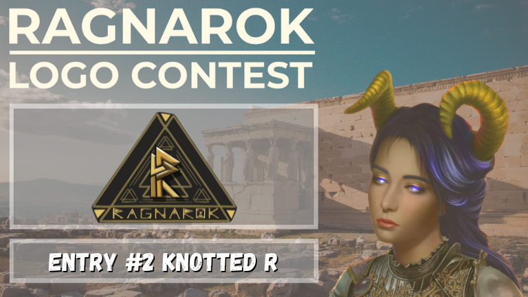
Ragnarok Logo Submission #2: "Ragnarok" Knotted R
Pretty late to the game, I saw this contest early on and was planning to enter it, however, due to some stressful circumstances in life, I completely forgot about it. So like a slacker in school, here I am making logos on the very last day of the contest just like it was always meant to be...
Like I said in the previous post: I'm super excited about this project, @ragnarok.game is an exciting multi-game universe that will come to fruition, where NFTs will be used across multiple projects, and to be frank: Is exactly what I've been wanting to see in NFT-Gaming for about 2 or 3 years now: These are transferrable assets: It's not just about ownership, you can take these assets into different Chains, into different Games, into different software! We've seen similar aspects of this in Gaming for as long as I can remember: Saves carrying over to sequels, trading Pokemon across versions and consoles, it's a unique aspect of ownership that games rarely focus on; But that's a rant for another time! You guys want to see some logos:
Finished Logo: Knotted R Style "Ragnarok"

Inspiration
Celtic Knotwork

Taking froma different piece of inspiration here, I took the Valknut previously explored, and wanted to emphasize it, and moved into Celtic Knots and Time is a symbolic concept for the logo: The idea here is that these worlds are intertwined, and time is running out. The Triangle represents 3 points touching, and three triangles interlocking: I wanted to bump up the Valknut's symbolism in this logo.
Valknut

Like previously, the Valknut plays a huge part in this logo: A symbol of 3 interconnected triangles, this felt like the best representation of the project: The coming together of multiple pantheons in war and in unity to stop the End Times.
With 3 simple, but powerful symbols, I had what I needed to create the logo.
Time
Ragnarok signifies a destined, unavoidable end of the world. The world's inescapable fate/destiny, where the three wolves devour the sun, the moon, and the earth, a war of the gods, humanity is wiped out...
Time is running out and I wanted to signify that in the text, utilizing the O that was previously a Valknut, this time, it's an Hour Glass.
Design Process
The Design process for this one was pretty straightforward:
- I created the original linework for the R, designing it based off the Valknut and creating a (hopefully) aesthetically pleasing but visually recognizable R utilizing various Brass and Gold colorings.
- Values and Highlights were then added to the initial linework, creating color and tone.
- In complete opposition to the last one: This one is clean, in case the gritty aspect of the other one is a negative. Or at least, it's as clean as it was going to be in the time I had to make it.
- Background Triangle was designed, utilizing the Valknut, and toned down in value and intensity to stay in the background and not fight the R.
- Drop Shadows for the R, to further enhance the R and pull it off of the background.
Things I would've liked to do:
Since I did this in about a day, along with the other design, I didn't get the opportunity to really experiment and find new concepts or ideas within the logo itself: A lot of the fun of making a logo is then modifying and experimenting with it, and I usually like to offer 2-3 different colorations: Here I was planning to do a Silver, Black and White Combination, along with a Earth Tone and Brass color combo, however, each of these would need a different type of glow effect and different shading, as I wanted it to be more brushed Brass/Silver. These will be things I refine later on as, at the very least, a 24 hour mock-up for my resume.
If I had started when I wanted to, and not become side tracked with Work and Life, I would've added a more realistic metallic texture, and a far more intricate backing triangle, incorporating more knotwork designs, and smaller design patterns in the 2 empty sections of the Valknut. I would've also cleaned the linework and made sure everything was equidistant and whatnot, but I'm pretty happy with the mock-up regardless.
Alas, these mock-ups were what I was able to get done in the time frame I made for myself outside of my contract work. You win some, you lose some. It was still fun to make.
If you'd like to see my first mock-up, you can do so here:
https://peakd.com/play2earn/@jakkal/ragnarok-logo-submission-1-ragnarok-stone-tablet
Interested?
If you like what you see, be sure to let me know in the comments below! If you'd like to contact me about designs for YOUR game or project, you can contact me via PMs and I will send you my e-mail address!
I love the second logo! Congratulations! And thank you for using the #pgm tag. !PGM !discovery 35
100 PGM token to send 0.1 PGM three times per day
500 to send and receive 0.1 PGM five times per day
1000 to send and receive 0.1 PGM ten times per day
Discord
Support the curation account with a delegation 10 HP - 50 HP - 100 HP - 500 HP - 1000 HP
This post was shared and voted inside the discord by the curators team of discovery-it
Join our community! hive-193212
Discovery-it is also a Witness, vote for us here
Delegate to us for passive income. Check our 80% fee-back Program
Your content has been voted as a part of Encouragement program. Keep up the good work!
Use Ecency daily to boost your growth on platform!
Support Ecency
Vote for new Proposal
Delegate HP and earn more
I like both of them,but this one is my fav! Awesome work :)
I'm also looking forward Ragnarok: it would be cool to have NFTs that can be carried across different games, in a universe rich of features! Also the setting (myths and mytology around the world) is super attractive.