Chuul Jujinchi | Splinterlands Art Contest 346
Hello Alien Art and Splinterlands community! We kick off this Monday with a new entry.
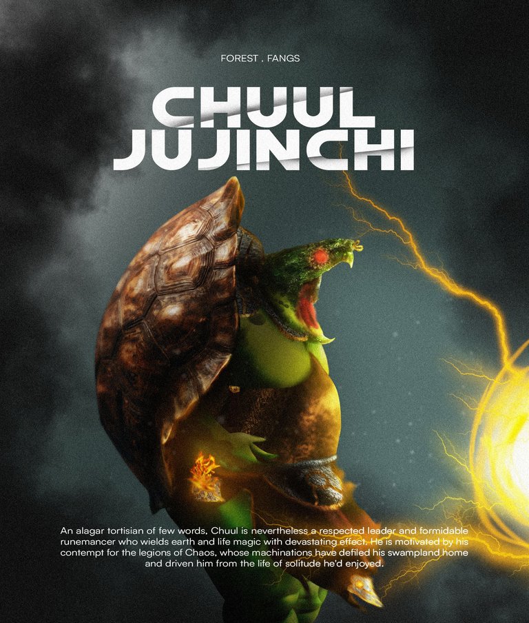
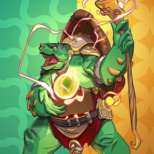
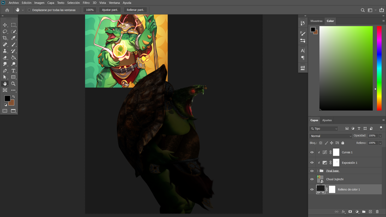
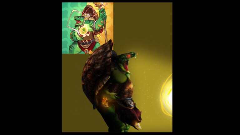
Today, I present Chuul Jujinchi, a side-profile version I found compelling to create especially to emphasize the energy orb featured on the cover.
The intention was to achieve a visually striking result by blending vibrant greens, reds, and yellows into the composition.
Join me in this creative journey and check out the final result of the piece!
Hola comunidad de Alien Art y Splinterlands, ¡arrancamos este lunes con una nueva participación! Hoy les presento a Chuul Jujinchi, una versión en vista de perfil que me pareció interesante desarrollar para poder destacar la bola de energía que aparece en la portada.
El objetivo fue lograr una imagen visualmente atractiva gracias a la combinación de colores como el verde, rojo y amarillo, que se integran en la composición para generar impacto.
¡Acompañame en este recorrido creativo y descubrí el resultado final de la obra!
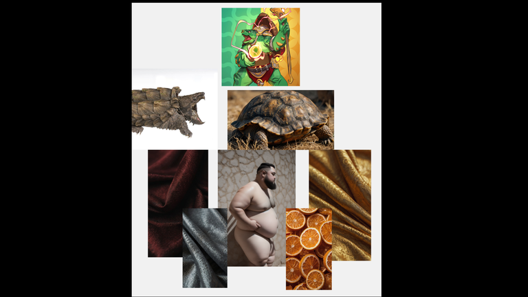
Here’s a general preview of the AI-generated elements. Once they were ready, I immediately began assembling the composition and visualizing how it would evolve during the process.
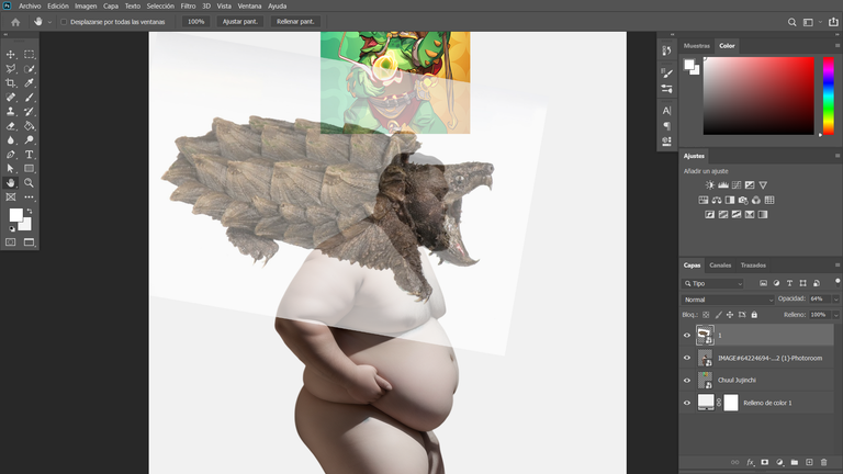
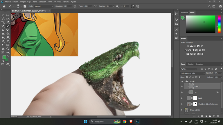
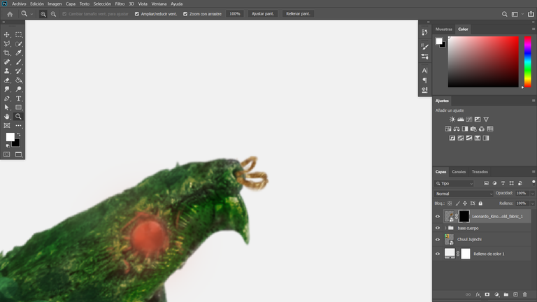
I started with the basics: the head. After removing the background from both images and setting up the base, I used the head of an alligator snapping turtle, which better matched the original design.
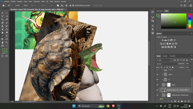
I then tested a few shades of green to see which ones would suit the skin and blend well. While I eventually set those tests aside, I added a side-view turtle shell behind the base of the character.
Step by step, it all started to take shape…
Aquí les comparto un muestreo general de los elementos creados con inteligencia artificial. Una vez generados, comencé inmediatamente con el armado de la composición e imaginé cómo se iría viendo durante el proceso.
Empecé por lo más básico: la cabeza. Tras eliminar el fondo de ambas imágenes y tener lista la base, utilicé la cabeza de una tortuga caimán, que encajaba mucho mejor con el diseño original.
Luego probé algunos tonos de verde para visualizar qué colores podrían funcionar en su piel y si se combinaban bien. Aunque dejé esas pruebas de lado, usé un caparazón de tortuga en vista lateral para colocarlo detrás de la base del personaje.
Poco a poco, todo iba tomando forma…

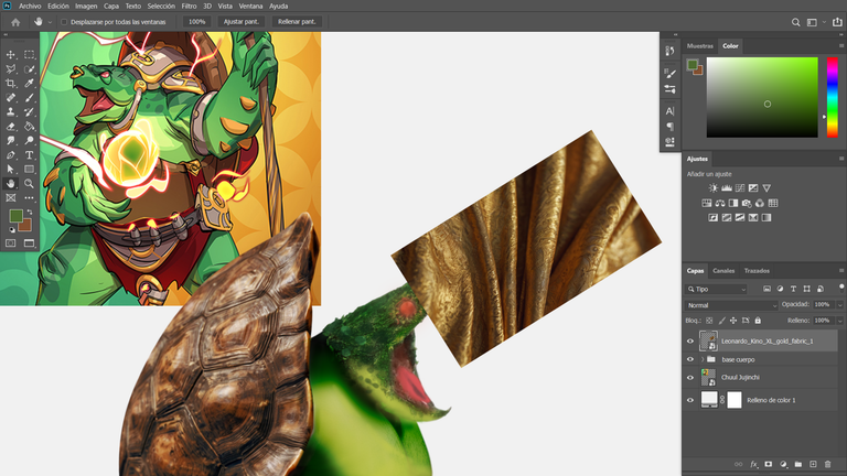
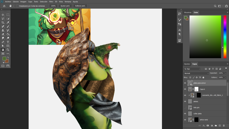
In this step-by-step sequence, I adjusted the hand design to resemble a turtle’s style. Then, using fabric pieces in gold, silver, and burgundy tones, I began crafting the outfit.
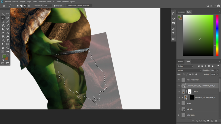
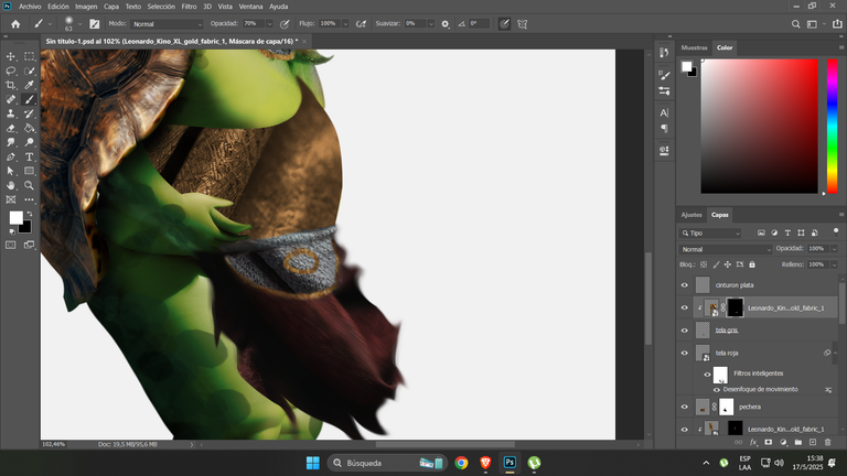
With the lasso tool, I cut and layered the fabrics to enhance the shadows and add depth. Using this method, I created the nose rings, the chest piece, and the lower garment with a torn piece of cloth, applying a motion effect to give it flow.
This wind-blown detail adds realism and makes the overall design feel more dynamic.
En esta secuencia de pasos, realicé un reajuste de su mano, dándole un estilo más parecido al de una tortuga. Luego, utilizando trozos de tela en tonos dorado, plateado y bordó, comencé a trabajar en su vestimenta.
Con la herramienta lazo, recorté y superpuse estas telas para aplicar mejor las sombras y generar profundidad. A partir de eso, creé los aros en la punta de su nariz, su pechera, y la parte inferior del atuendo, utilizando un trozo de tela desgarrada al que le apliqué un efecto de movimiento.
Ese detalle de la ventisca ayuda a aportar realismo y dinamismo al diseño general.
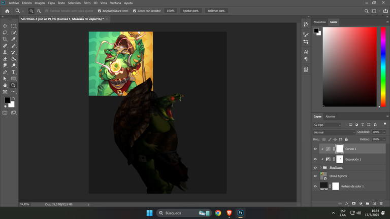
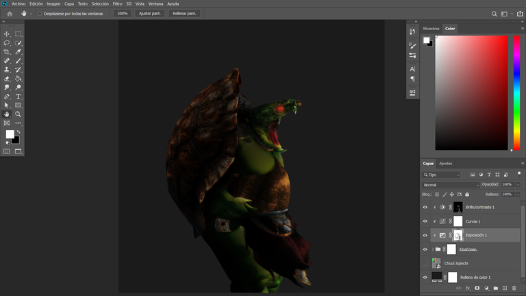
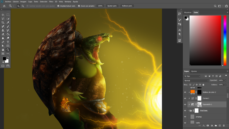
Once I had the full structure of the design in place, my favorite part began: working with light and shadow. By using negative exposure, the design takes on a completely different look, allowing key areas to stand out with highlighted lighting.
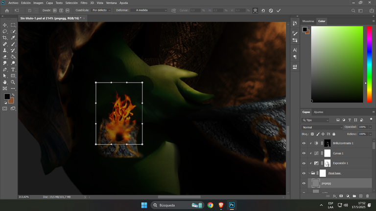
With patience, I started refining each light focus. At this stage, I finished creating the box emitting fire, and after integrating it, I began to play with glows around the character’s arm and shell.
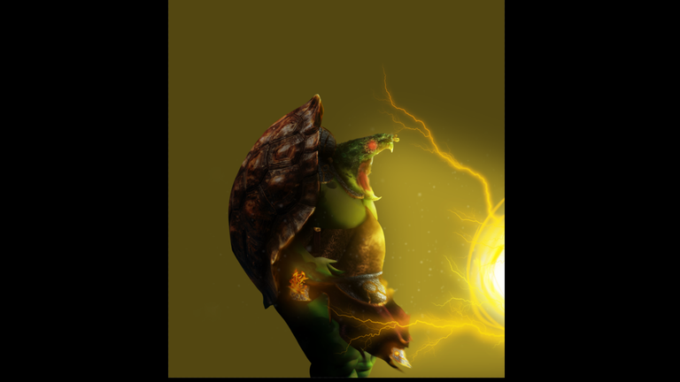
Originally, the background featured a green and yellow contrast, but I eventually replaced it with a dark bluish tone, which makes the yellow pop even more and creates a more practical and dramatic mood.
The energy orb was hand-painted using white, yellow, and a touch of orange pencil to create a bright emission effect.
To finalize the scene, the background was composed using black smoke and a backlight that highlights the shell, adding depth to the overall design.
Una vez que tengo todo estructurado en base al diseño, comienza mi parte favorita: el uso de sombras y luces. Al aplicar exposición negativa, el diseño adquiere una perspectiva completamente distinta, permitiéndome destacar puntos específicos con luces brillantes.
Con paciencia, fui marcando cada foco de luz. Aquí fue cuando terminé de crear esa especie de caja que emite fuego; tras integrarla, comencé a jugar con los resplandores en el brazo y el caparazón del personaje.
Inicialmente, el fondo contrastaba entre verde y amarillo, pero decidí reemplazarlo por un azulado oscuro, que realza mejor los tonos amarillos y genera un ambiente más práctico y dramático.
La bola de energía fue pintada manualmente con lápiz blanco, amarillo y un tono anaranjado para lograr un efecto de emisión resplandeciente.
Finalmente, el fondo fue trabajado con humo negro y una luz suave desde atrás para resaltar el caparazón, aportando mayor profundidad al diseño final.
FINAL ART
Thanks for sharing! - @isaria

https://x.com/AlienArtHive/status/1924858907958378843