First Impressions of LeoFinance's New UI
LeoFinance has launched it's new UI which might be a bit confusing for some users but that's okay as sometimes a new thing takes some time to understand and same is the case with the new LeoFinance UI.
I believe, things will get normal when we are used to the new LeoFinance UI.
So far, I have noticed a few things on the new LeoFinance UI which I think is a cool addition to LeoFinance.
Posts Recommendation
You may have noticed that opening a post from a user, you will se more posts from USERNAME, which is a good thing to see. Like in my case, this is how it looks.
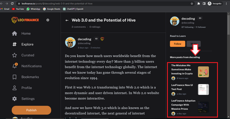
These type of recommendations we would saw on blogs and other web2 websites.
Pop-up Display
This is probably my favorite on this new LeoFinance UI. You may have noticed the pop-up when hovering your mouse on a profile.
You don't need to sneak into other users wallet now as you can now see their Leo portfolio straightaway.
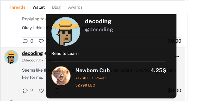
Isn't it awesome?
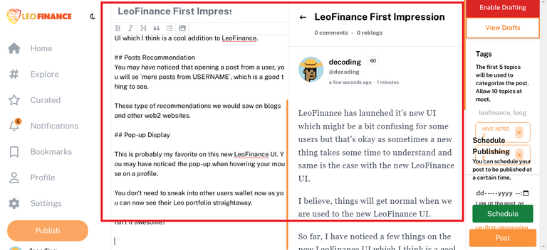
Post Display While Writing
I don't know about other users but to me, the recent post display while writing a post looks cool.
It sort of gives a complete look to your post where you can have a good look at it and check if something is missing or the picture you uploaded is displayed or not.
Closing Thoughts
The interface does need more development to make it work flawlessly which I am believe the team would be working behind.
But talking of the first impressions of the new UI, I kind of liked it.
Good to see the new cool features.
Follow me:
Hive: @decoding
Twitter: www.twitter.com/decoding1011
Discord: decoding#9631
Congratulations @decoding! You have completed the following achievement on the Hive blockchain And have been rewarded with New badge(s)
Your next target is to reach 300 replies.
You can view your badges on your board and compare yourself to others in the Ranking
If you no longer want to receive notifications, reply to this comment with the word
STOPCheck out our last posts:
Support the HiveBuzz project. Vote for our proposal!