InLEO or InLED? A Journey into bad typography (and a Fix Suggested)
I think this rebranding is great, to begin with. I want to get that out of the way right now. Limiting themselves to finance always felt limiting. In theory it might be a good idea, but in practice we just don't have enough people on Hive to support that.
Hey, I should know all about having a tiny, limited niche, I run a poetry community (Blockchain Poets - Go join us!) on Hive.
Anyway, so I like this rebrand into a general community. Let's be clear. Because what I say next may sound negative, but I don't intend it to be hostile, rather helpful at calling out what I see as a weak point of this rebrand.
Namely this:

This logo is terrible.
The stylized outline of a lion's face is fine, as is the name InLEO. What is terrible is the font.
Is it InLEO or InLED?
Most of us on Hive are familiar with the Leo guys and their use of lions. We can see this is suppose to be InLEO. ...can't we? It seems like we should, yet the first time I saw this logo uploaded to the SilverGoldStackers discord, I mentally read it as InLED, thinking that it must have been another new Hive game, some kind of sci-fi themed card game in space or something.
I left this comment on one of the announcement posts and someone replied that they also misread it as InLED. If two people misread it, I think we can assume others are misreading it as well. And we are the ones most familiar with Leo. People not familiar with Leo of Hive are even more likely to misread it.
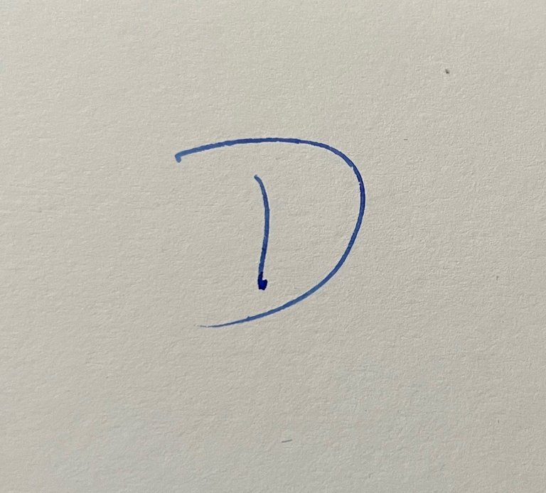
The problem is two fold. First, the font is going for a very typical sci-fi look and is using the stylized gap in the left line of the N E and D to achieve this look as well as the boxy letters suggestive of a computer display. That's all well and good, but it's a very bad choice for the letter O. Instead of implying a sci-fi-esque O, it rather suggests a D where the upper line for the curve started a little above and perhaps a little to the left of the downward line. Like many people write their D's. Like this:

With that gap at the top of the left line of the O, it makes it look like a D.
The second problem is that because this character is kind of confusing, people are going to look to context clues to guess what letter and therefore what word it should be. The sci-fi look of the font instantly suggests LED, making that confusing O/D thing look more like a D.
I think this is a mistake that we shouldn't ignore. Yes, even if people initially misread the logo, they will be corrected as soon as they come to Hive and look around or talk to @khaleelkazi or @anomadsoul. That's true. But I think we don't want them give them any time to form mistaken impressions. First impressions are everything, right? This is not to mention that people who just glance at the logo on Twitter X and don't follow the link to Hive or read any of the text in the tweet, might think InLED and carry that thought around for the rest of the day.
Luckily there is a fix! Just color in that gap. Like so:

It's not perfect, but without the gap it looks much more like an O to my eyes—it's much better with the gap colored in, less suggestive of a capital D and more suggestive of an O.
Anyway, that is all. Maybe I'm being pedantic. But I do think details are very important. Design is important. Using the correct font is important.
Anyway, for your consideration, Khal and Eric. If you think I'm making a mountain out of a molehill, so be it. But if you can see my point, feel free to use that "fixed" logo I made (I just used a paintbrush in Photoshop; you could probably do a better job than me). Let's tag @edicted and @bitcoinflood too, just to make sure some Leo frens with more influence than me see this.
❦
 |
David LaSpina is an American photographer and translator lost in Japan, trying to capture the beauty of this country one photo at a time and searching for the perfect haiku. |
Interesting. I hadn't really paid too much attention to it. I guess I just assumed it was Leo. I can see what you are saying though.
I think it can go either way, probably depending on the context when you first see it. If you are on Hive and looking at a post from a Leo person, the context is strong enough to tell us it's InLEO. But if we take that context away and show you the logo on it's own, I think we would lean towards thinking InLED. But either way, I think that uncertainty is bad.
Yeah, I can see that.
This is a valid point with an elegant solution. Props!
Thanks! Let's see if they listen to me.
Good proposal. 👍🏻 My worry though is a bit more general. Namely that with this rebrand we might loose focus, moving away from the finance core, going into a wide open space where it’s not defined anymore what Leo community stands for.
I can see that. But I don't think that will happen as long as the Leo community has clear leadership. The standout feature is Threads, and that right there makes Leo standout. But yeah, it is a valid concern.
Well, Leo calls it Threads, Ecency copied that and calls it Waves. And if they can do it other UI can too. Apart from DBuzz also offering a short content posting mechanism. For me that’s not the big stand alone. 🤷🏼♂️
Agreed, should be changed.
This is something to bring up. maybe better in AMA and ask if this can be changed uwu
I thought it might get more attention to make the post, but yeah, I can try mentioning it to them directly on Discord.
ya this is probably the best way. i heard someone say they will look into changing it
Thought about that too first time I saw it.
I totally agree with you and in all honesty I really love the full lion's face that was used, it made the logo very unique.
Nicely put together dear friend!
Thanks!
It just get started, with time everything will fall in pleasant places.
👍
knowing the name I always read inleo but actually if I put myself in the shoes of someone who sees the new logo for the first time reading it inled it is possible.
I think your solution is a good one that would improve readability.
This is truly a valid point
Maybe they should make another logo so we won't be misled