Ragnarok Logo Contest
The logo of Ragnarok should portray the competitive nature of the game along with a clear sense of the epicness behind the story. At the first glance, it should feel like action, epicness, competitiveness while also bearing some sort of resemblance to the lore..which is spread out between multiple myths from around the globe.
My main aim is to find a way to connect to the players. Since it is a game where competitors have the chance to be the champion every year with their choice of card collection, I thought it would be a neat psychological trick to create a podium-styled structure using potential characters from the game that would lead the player to imagine themselves at the center of the podium.

But the suggestion has to be subtle. And to make it cohesive with the game, placing characters of the game in such a layer instead of having a literal podium makes more sense.
Ragnarok is an action-packed game where literally all realms come to war. It has to look chaotic and grungy. But readable.
While I was researching action games, I realized most of the action games had one thing in common. A deep orangish color. It seems to me that this color is often associated with action and excitement.
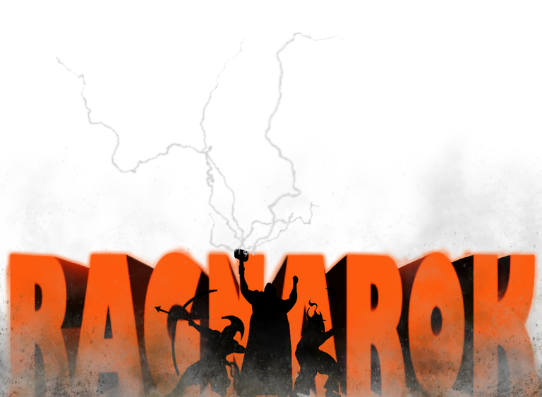
To put it all together, my logo would need a podium, characters, action, epicness. Here is the first draft:
Looks cool, eh?
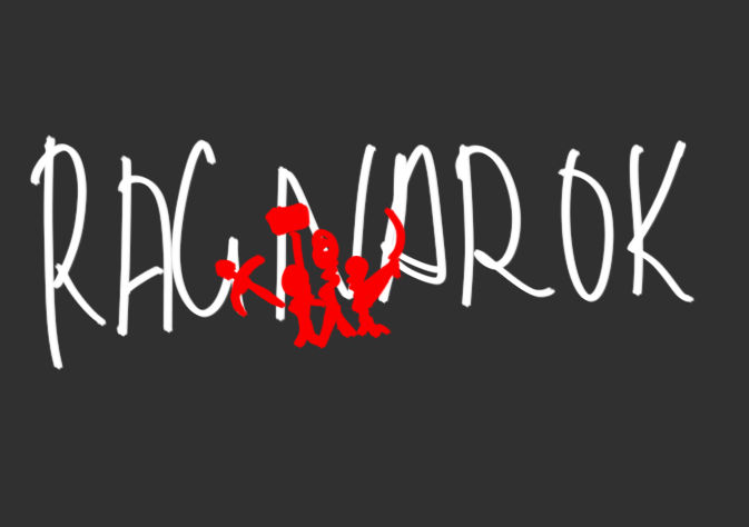
I started out by painting in the three characters which would represent the cards and the podium. I looked up mythical warriors and I chose Thor to be in the center since it turns out he is the most popular on the internet. Call it whatever you like, popular notions are very important to grab attention.
I made one a fighter/mage, an archer, and a swordsman. I tried giving them distinct features which would show the wide range of characters that players could find in the game.
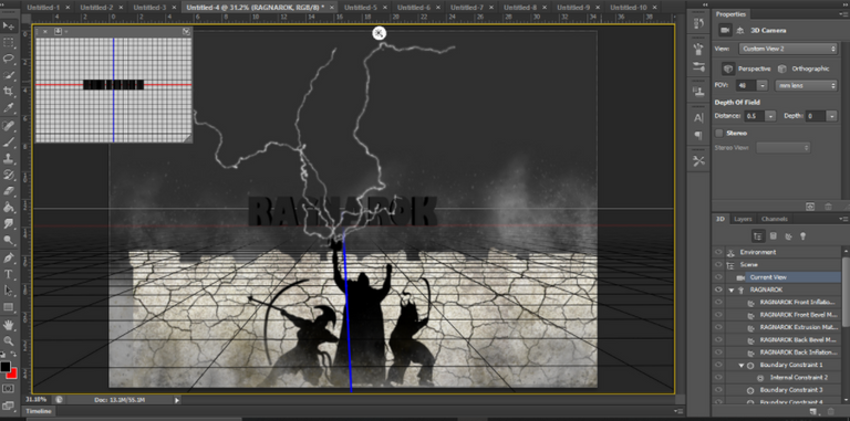
For the text, I render a 3D object with depth and shadows.
I chose this style since it would help add a dynamic angle to the logo. A 2D text against a silhouette of characters would feel very boring and mundane. 3D is far more exciting.
It also gives me the chance to sneak in the color of excitement and action I found mutual in many action games like God of War, Judgement, Battlefied, Die Hard, etc. etc.
I added some shadows to the 3D element and gave it a very light orangish glow to make it pop.
Now it is time to add the feel of the game. I.e., action and epicness. A competitive battlefield needs chaos, grunge, and destruction. I did this by adding texture to the foreground and background which could easily be read as action on the battlefield.
I used mainly ash and white on the background and a mix of mud brown and dark red on white on the foreground.
The final touch was to add some rays of electricity to make it look a little more epic.
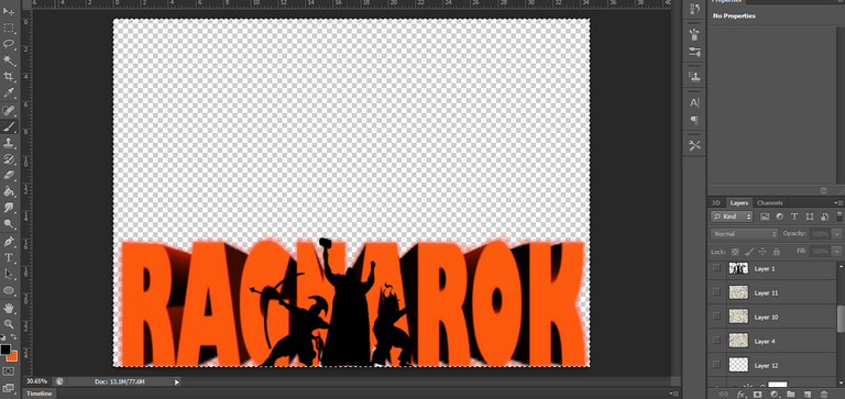
I want to leave it as a vector with a plain background since it helps place the logo on different backgrounds without losing parts of any elements.
An invisible background vector is also an easier option when trying to create animations for videos or ads.
This is more of a combination mark logo that is usually best for PC, posters, banners and so on.

I used the same principles to create button logos that could more easily be merged into a phone view, tablet view, or even used as buttons.
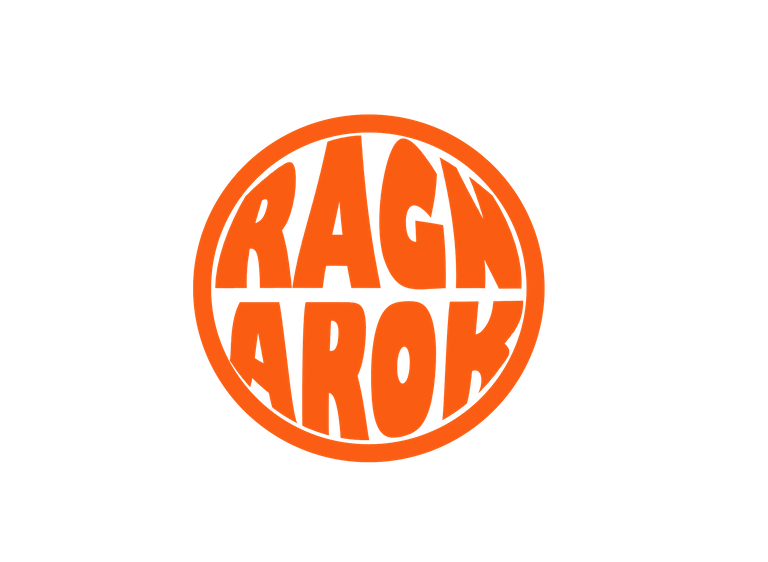
I used the same text style for consistency and repeatability. The color of choice was obviously the orange shade which is used in many action games. It is a png file that can be sized and used as a logo for tablet and phone view while substituting as buttons on PC view.
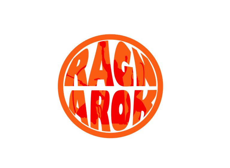
For the choice of emblem, I used the same 3 characters I painted as a podium and burned them onto the text logo to still maintain a level of suggestion of competitiveness and character epicness.

Affiliate links
Rising Star
Exode
Huobi
Appics
Splinterlands
Actifit
Binance
Ionomy
Cryptex
Electronic-terrorism, voice to skull and neuro monitoring on Hive and Steem. You can ignore this, but your going to wish you didnt soon. This is happening whether you believe it or not. https://ecency.com/fyrstikken/@fairandbalanced/i-am-the-only-motherfucker-on-the-internet-pointing-to-a-direct-source-for-voice-to-skull-electronic-terrorism
https://twitter.com/Blind_spot7/status/1490802972930023430
The rewards earned on this comment will go directly to the person sharing the post on Twitter as long as they are registered with @poshtoken. Sign up at https://hiveposh.com.
Nice choice of design, I love the lightening display and the choice of color. Orange
Yeah I found that color super appealing. The lightening display does look good.
Thanks for stopping by!
Thank you for sharing this amazing post on HIVE!
Your content got selected by our fellow curator @priyanarc & you just received a little thank you via an upvote from our non-profit curation initiative!
You will be featured in one of our recurring curation compilations and on our pinterest boards! Both are aiming to offer you a stage to widen your audience within and outside of the DIY scene of hive.
Join the official DIYHub community on HIVE and show us more of your amazing work and feel free to connect with us and other DIYers via our discord server: https://discord.gg/mY5uCfQ !
If you want to support our goal to motivate other DIY/art/music/homesteading/... creators just delegate to us and earn 100% of your curation rewards!
Stay creative & hive on!