Animated Ragnarok logo - design to finish.
In this video I show you the inspiration behind this design and the entire process from draft to finish.
I used Adobe Photoshop CS6 to design the stamp logo and then used Filmora to animate the design. The design evolved in differnt ways as I kept improving the draft.

I had the same idea, as before, to use suggestive design for both attraction and defining the game. Unlike the last logo, I used weapons of different myths and eras along with the designs instead of characters. I think it leaves more open interpretation on the table and does not constrict me to find designs that will exactly fit the characters of the game.
Here, I used the same idea of podiums to suggest competitveness and challenge. I integrated it into the elipse of the logo along with what looked to me like a "difficulty meter". All the elements are unique in the logo and designed with my individualistic touch.

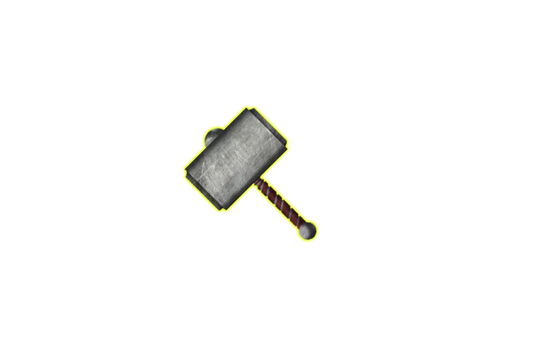

I am a huge fan of vectors and invisible backgrounds and I love how flexibly they can be used. So naturally, this logo is also as such. I have also created different versions with varying backgrounds to see how the logo looks like against different colors.

The text as a simple warp effect and can be added or placed independently. Most games nowadays use "mascots" instead of trying to identify themselves with the names directly, so I created an arc for the text to sit on with a "script-like" font so it fits the theme.
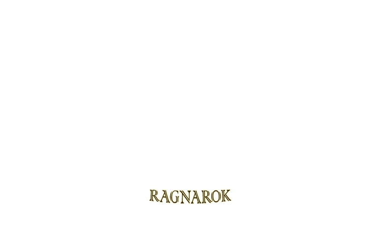
More info about the logo design and color choices in the video, along with the process of making the logo.

Affiliate links
Rising Star
Exode
Huobi
Appics
Splinterlands
Actifit
Binance
Ionomy
Cryptex
▶️ 3Speak
https://twitter.com/Blind_spot7/status/1491136075498078210
The rewards earned on this comment will go directly to the person sharing the post on Twitter as long as they are registered with @poshtoken. Sign up at https://hiveposh.com.
Manual selection by @cliffagreen.