🐝 BeeBalanced Update – SPL Metrics Are Here!

Welcome back to the BeeBalanced blog! We’ve got a new release to share with you all.
So, @azircon asked if we could dig a little deeper into the SPL metrics side of things. There’s already a Discord bot out there showing some of this info, and Peakmonsters does a solid job of presenting it their own way too.
But… we wanted to take it a step further by using the Splinterlands API directly and building our own view. And of course, throw in a little fun factor while we’re at it.

🔌 The Endpoint We’re Using
The data comes straight from here:
👉 https://api.splinterlands.com/transactions/metrics
If you’re new to the Splinterlands API, you’ll love their Swagger docs. The team did a great job making it accessible for everyone:
📘 Game API: https://api2.splinterlands.com/doc/
🌾 Land API: https://vapi.splinterlands.com/swagger/#/
📊 What You’ll See
Head over to the new metrics page:
👉 https://beebalanced.streamlit.app/spl_metrics_page
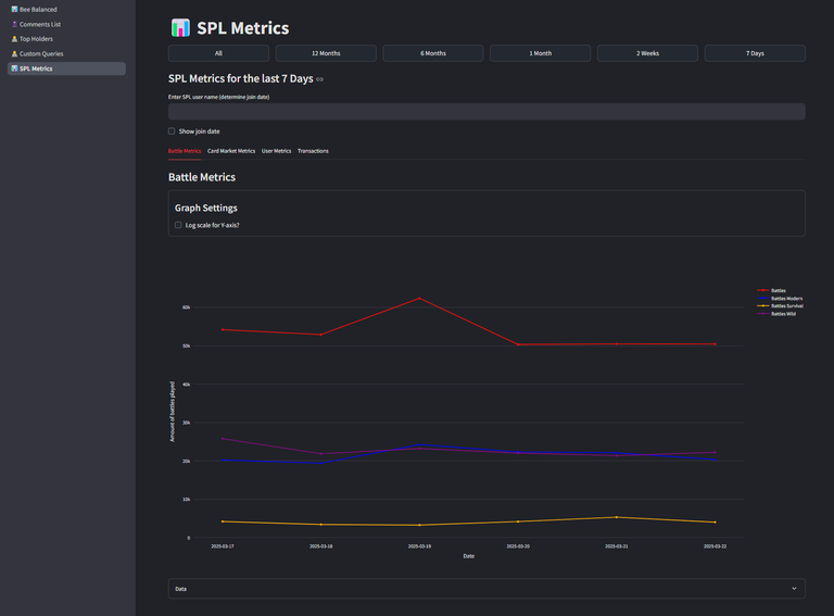
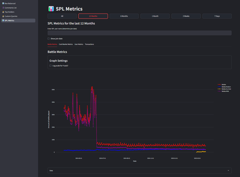
By default, it shows a 7-day view, but you can easily change the timeframe with the buttons at the top.
This is where we go beyond what Peakmonsters and the Discord bot offer:
- No limit in data range
- Fully interactive charts — zoom, pan, select, export — it's all there!
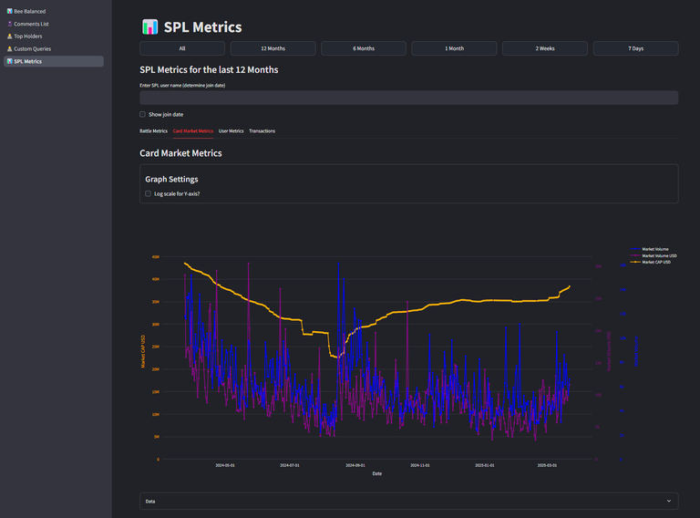
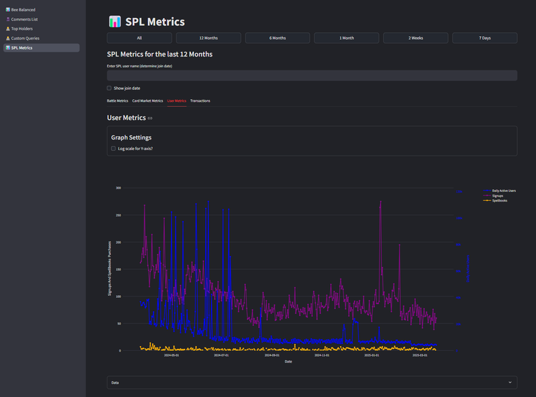
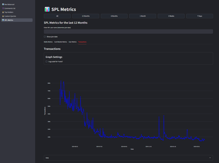
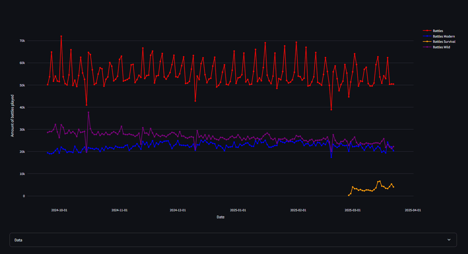
Explore the Four Metrics Tabs
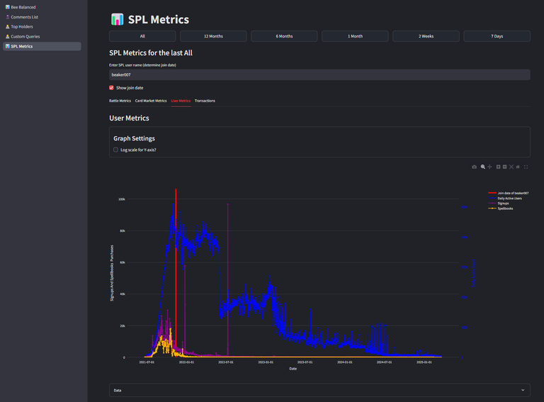
We’ve split the data into 4 main categories, each on its own tab:
- Battle Metrics
2.Card Market Metrics
- User Metrics
- Transactions
What I’ll be keeping an eye on in the coming weeks/months when the marketing push starting:
- Spellbook purchases
- Daily battle counts
- Transaction trends
📈 Log Scale – Why It Matters
You’ll see an option to switch the Y-axis to log scale.
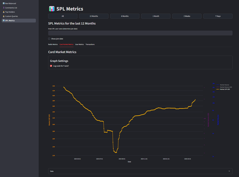
So why is log scale useful?
Log scale is handy when your data spans a huge range. Instead of getting a flat line for smaller values and a massive spike for bigger ones, a log scale compresses those big differences and helps you see trends more clearly, even when numbers vary by orders of magnitude.
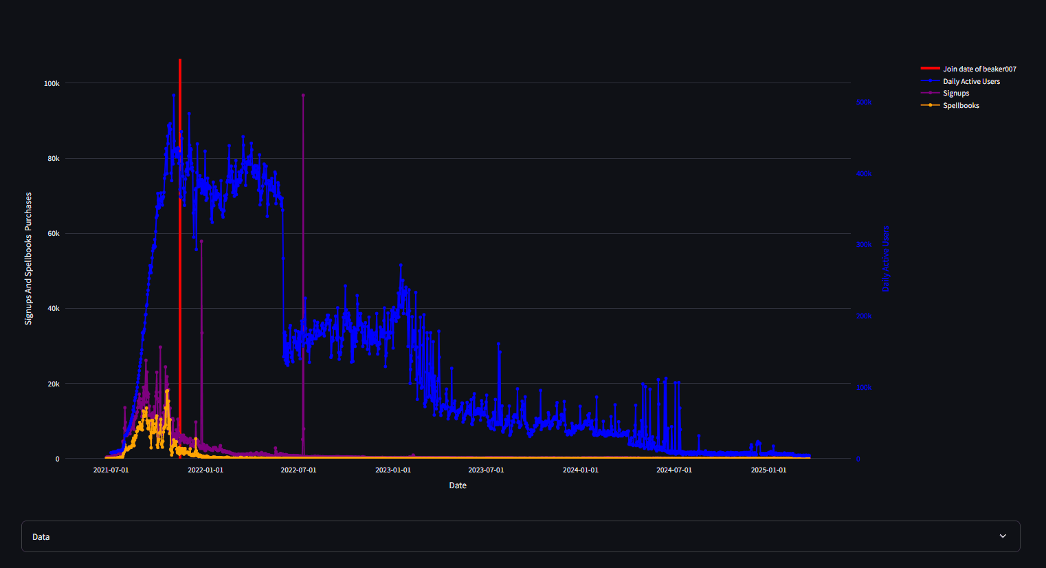
🎯 Bonus Fun: See When a Player Joined
Wanna know when a player started their Splinterlands journey?
Just enter a username, tick “Show Join Date,” and it’ll plot their join date on the chart. Super cool to see where in the hype cycle someone jumped in.
Here’s mine as an example:
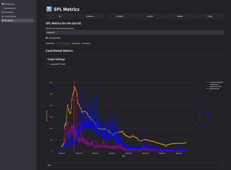
In the middle of the hype or 2021 🤣. I never regretted that this is the way i discover splinterlands and hive. Still enjoying it every day... and yes for asset values i hope there will be better days, turning my red number in at least a neutral position 🤣.
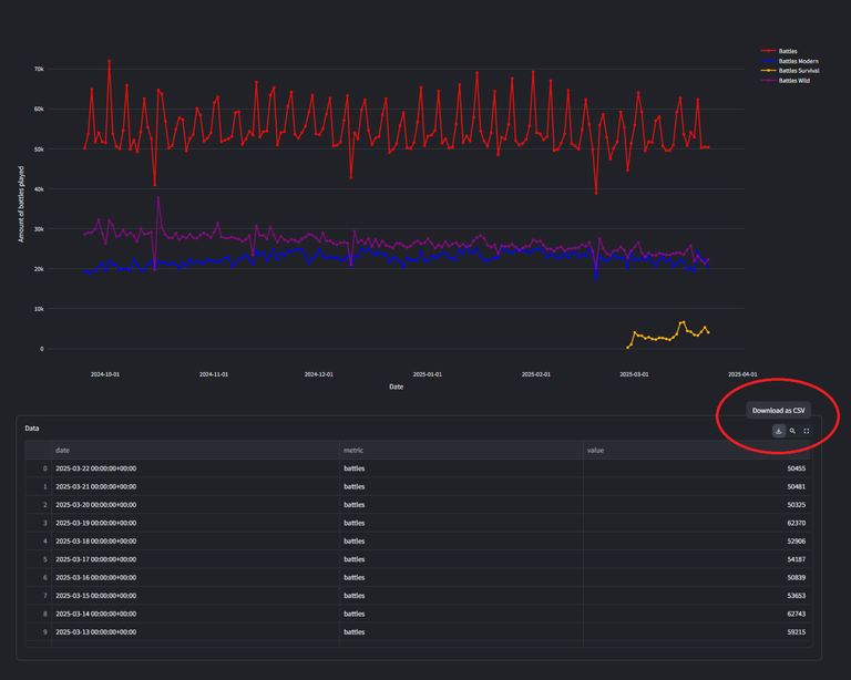
🛠️ Pro Tips for Using the Charts
This is basically for all charts that are being used in beebalanced.
- Drag and Zoom: Select areas to zoom in (box, vertical, or horizontal) (gif showing zooming)
- Line Selection: Click to toggle lines, double-click to isolate or reset
- Double-Click on Graph: Resets the axes
- Download Options: Grab the chart as a PNG with one click

And if that’s not enough, hit the Download CSV button and do your own plotting in your favorite tool. Excel, Google Sheets, Python — whatever works for you!
So there you have it! I hope you enjoy the new feature — SPL Metrics are now live on BeeBalanced! 🎉
If you’ve got feedback, things you’d like to see improved, or totally new ideas… drop me a message. I’d love to make this tool even better with your help.
Happy days to all of you!🐝
Bee Balanced
Congratulations @beaker007! You have completed the following achievement on the Hive blockchain And have been rewarded with New badge(s)
Your next target is to reach 50000 upvotes.
You can view your badges on your board and compare yourself to others in the Ranking
If you no longer want to receive notifications, reply to this comment with the word
STOPThanks for sharing! - @azircon

great tool, thankyou!
Things look a little sad on the all time scale but nice to see the card market bumping up a bit recently
A bit sad it is but also the context is important those highs where with many bot farms.