Splinterlands Art Contest - Week 354 - Mischievous Mermaid
Hey there, folks. How's it been going for you? It's that time of the week again - yes, my Splinterlands Art Contest entry submission. This week, I decided to draw the Mischievous Mermaid.
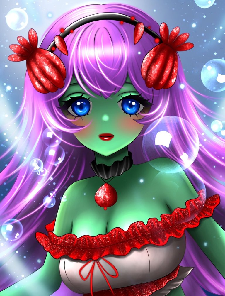
I did the usual thing by using the original art's base color palette and added a few details I thought would look good on her as well. I modified her tops a little bit - I kept red as the primary color (the frills on it) and the gray-ish white as the secondary color. The red was also used on her headwear, and that made the middle of the drawing empty of that red, and I wanted it to be distributed (even though not evenly) along the entire canvas, so I added another accessory - the necklace, which I also used the red in. Her lips are also red, but I'm not sure that would've counted since it's not as big and not an item on her.
Anyway, this is it for this week's submission. Let me know what you think about this piece in the comments down below, looking forward to knowing your thoughts and opinions about it. I'll see you all in next week's contest as always, until then, good luck and... cheers~~
The Process

I started off by using the base pink color on her hair and working my way off of that towards her body and clothes. I avoided touching the background before adding some general details to the flat colors.


In this stage, I had to do the magic by adding the final details to her hair. Some white highlights and darker tones of pink to give the hair some volume and make it look more fluffy. I avoided using too many darker strains to avoid making my character look evil or gloomy - the image after the next shows how bad and evil it makes the drawing look if too much dark color is used.
Honestly, I'm so relieved that it's a digital drawing so I can freely experiment with colors as I see fit, without a single worry about leaving traces or stains if I make any mistake coloring or even sketching (new colors can also be added on top of existing colors with no worry which is pretty hard to pull off when dealing with pencils and paper in traditional drawing)

Toning her skin darker gave me the opening to go for highlighting parts of her and giving my character some volume and a dimensional feeling

I opted for a dark blue background at first, but seeing how the colors came together in the end, I thought that would make the piece look too dark or saturated in color. So I started by adding some light rays here and there - sunlight piercing through he ocean and illuminating the depths. Last, but not least, in addition to the sun rays coming from different directions, I also turned the flat dark blue color behind her into a circular gradient from white to the dark blue that I was using before - since the blue goes behind my character, it feels somewhat non-existent, but it's definitely there (look behind her hair).

The bubbles also made the piece not look too empty, and I was more than happy to add them to the final result since she's an aquatic character, and that goes well with the context. They add some more white to the overall piece, which helps lift off the dark and gloomy mood of the painting if it had gone that way.
The Result

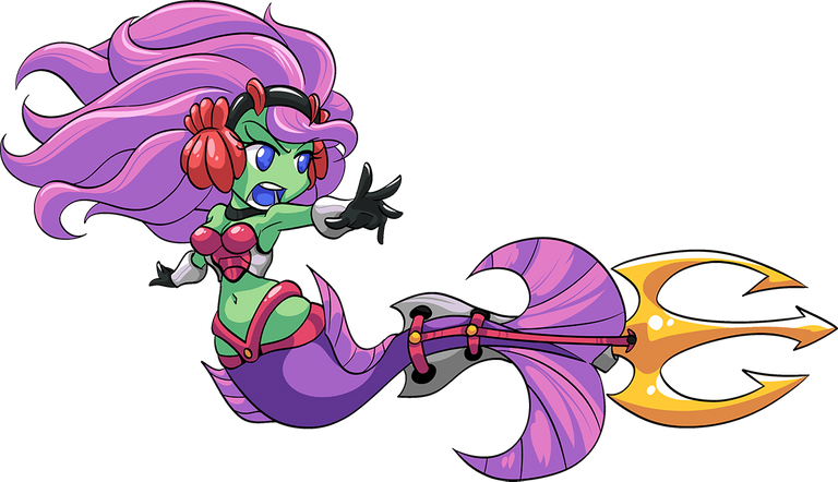
Original Game Art
Delegate Tokens and HP to Fallen Angels to earn weekly rewards!
Delegate | Join to the guild
Thanks for sharing! - @cieliss

https://x.com/AlienArtHive/status/1946176306783158767